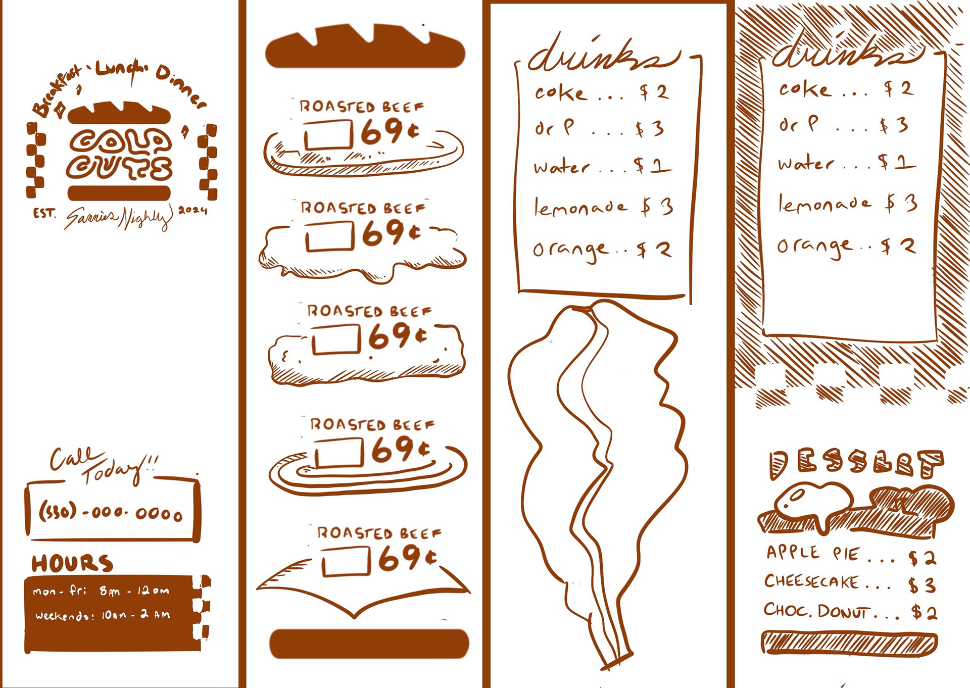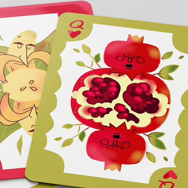


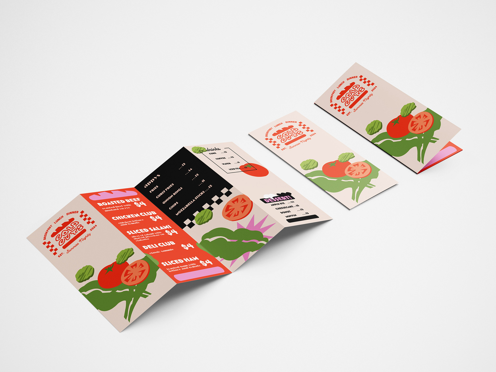
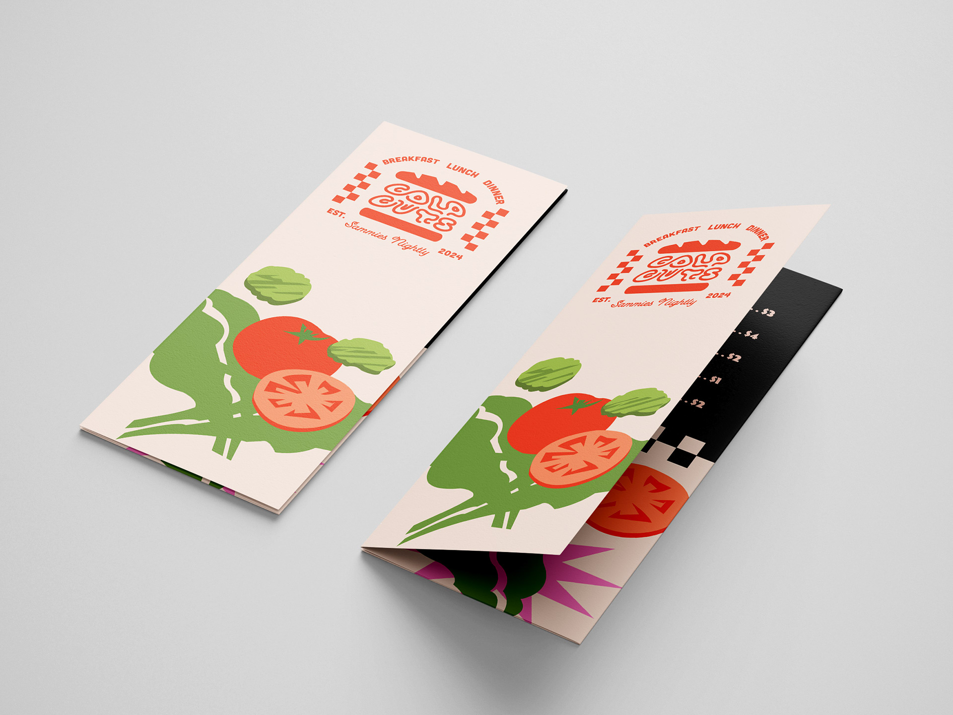
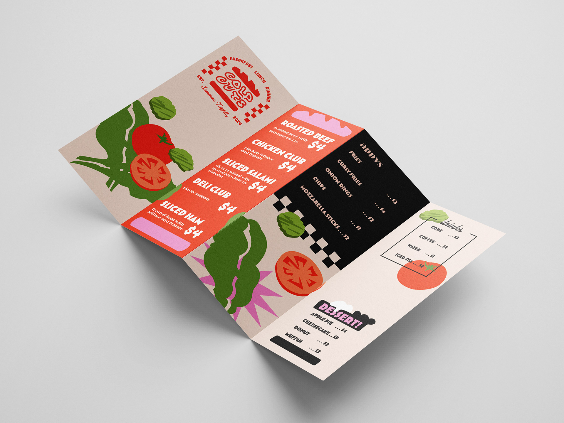
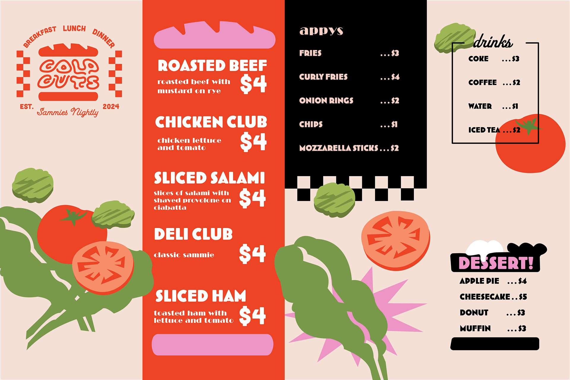
I kept the illustrations flat, bold, and graphic so they could become part of the menu itself rather than just decorative elements. The reds and blacks pay homage to classic deli color palettes, while the greens and pinks add a fresh, fun contrast that gives the brand a more youthful personality.
Exploration:
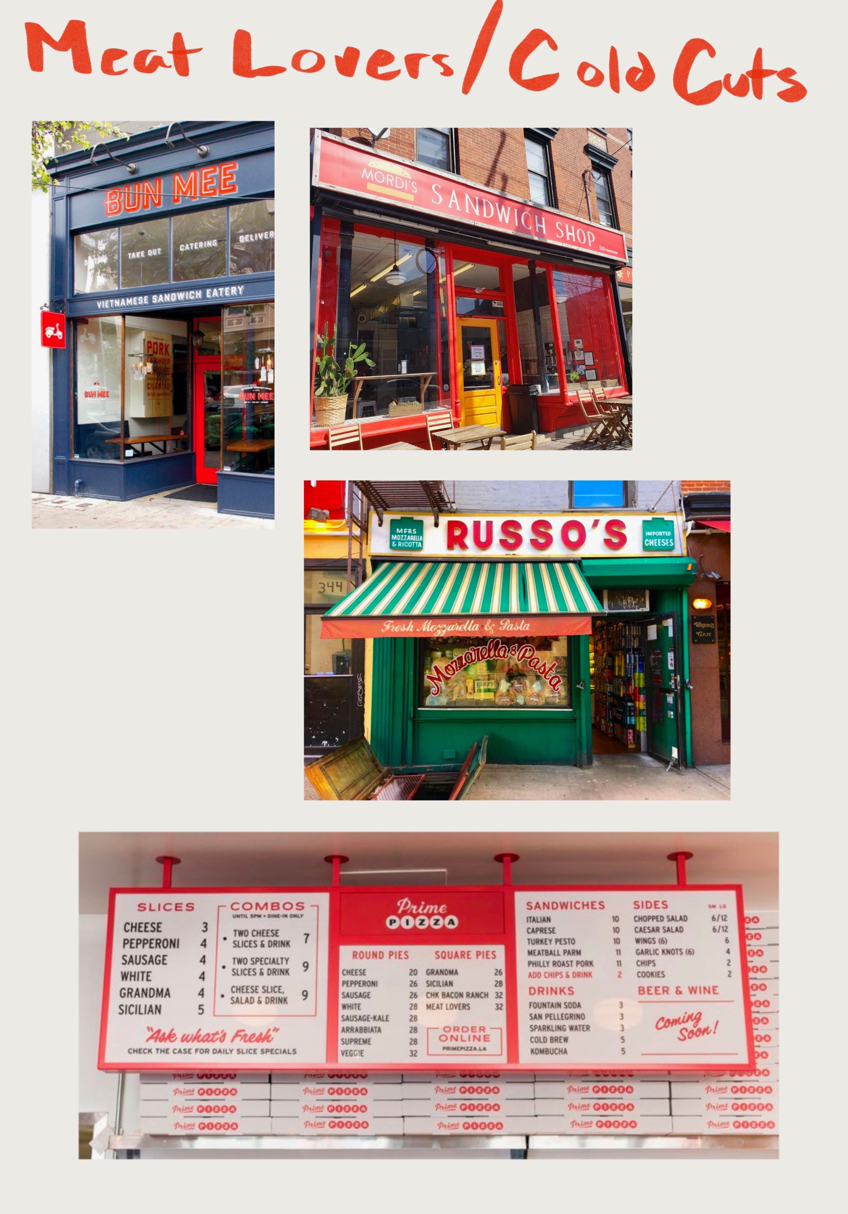
I started by looking into vintage diners, retro signage, and classic deli menus to understand what made those designs feel nostalgic and memorable. I wanted to bring that same charm into a younger, more playful brand while incorporating the clean, minimalistic style often seen more modern restaurants.