


Exploration:
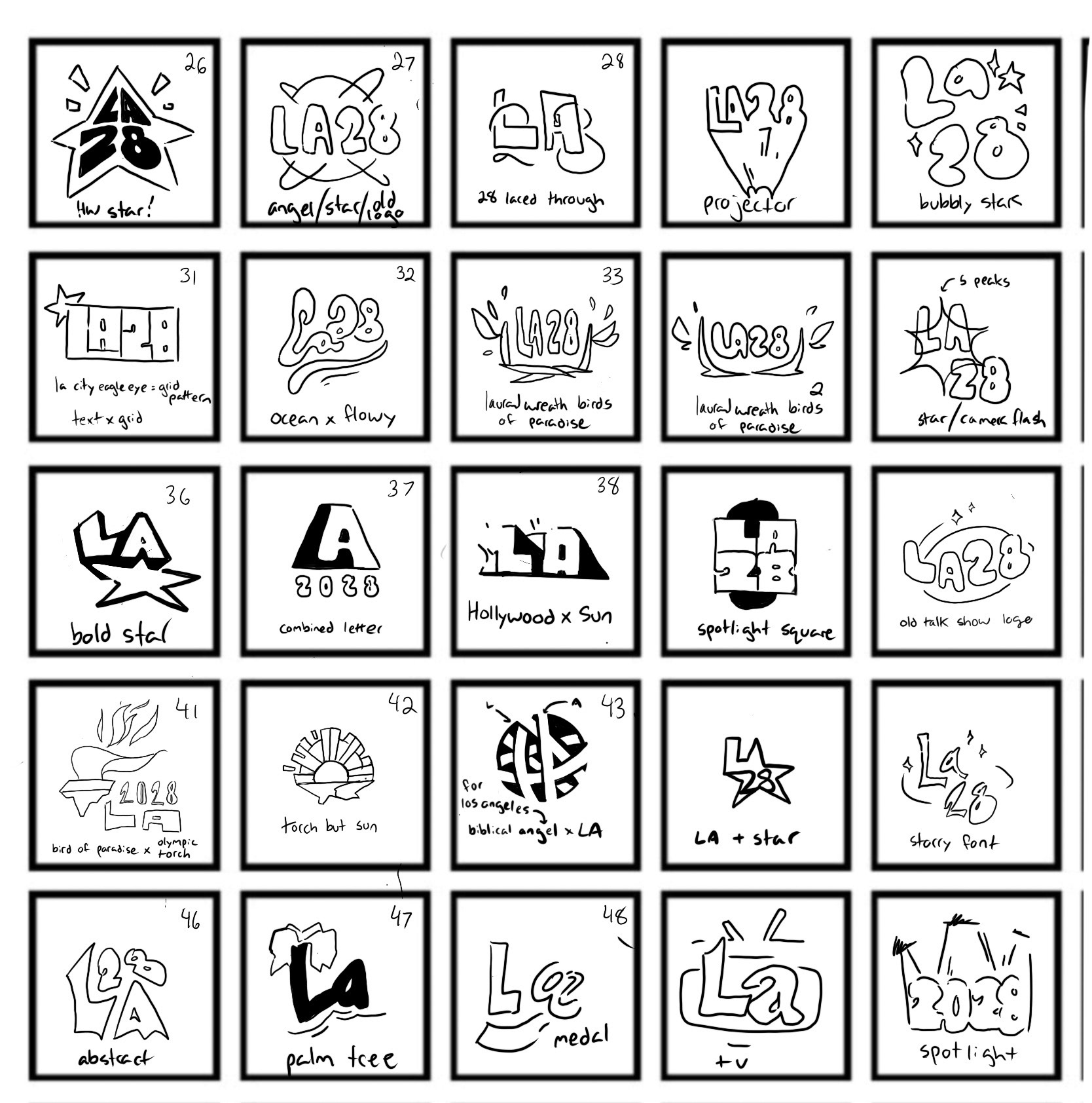
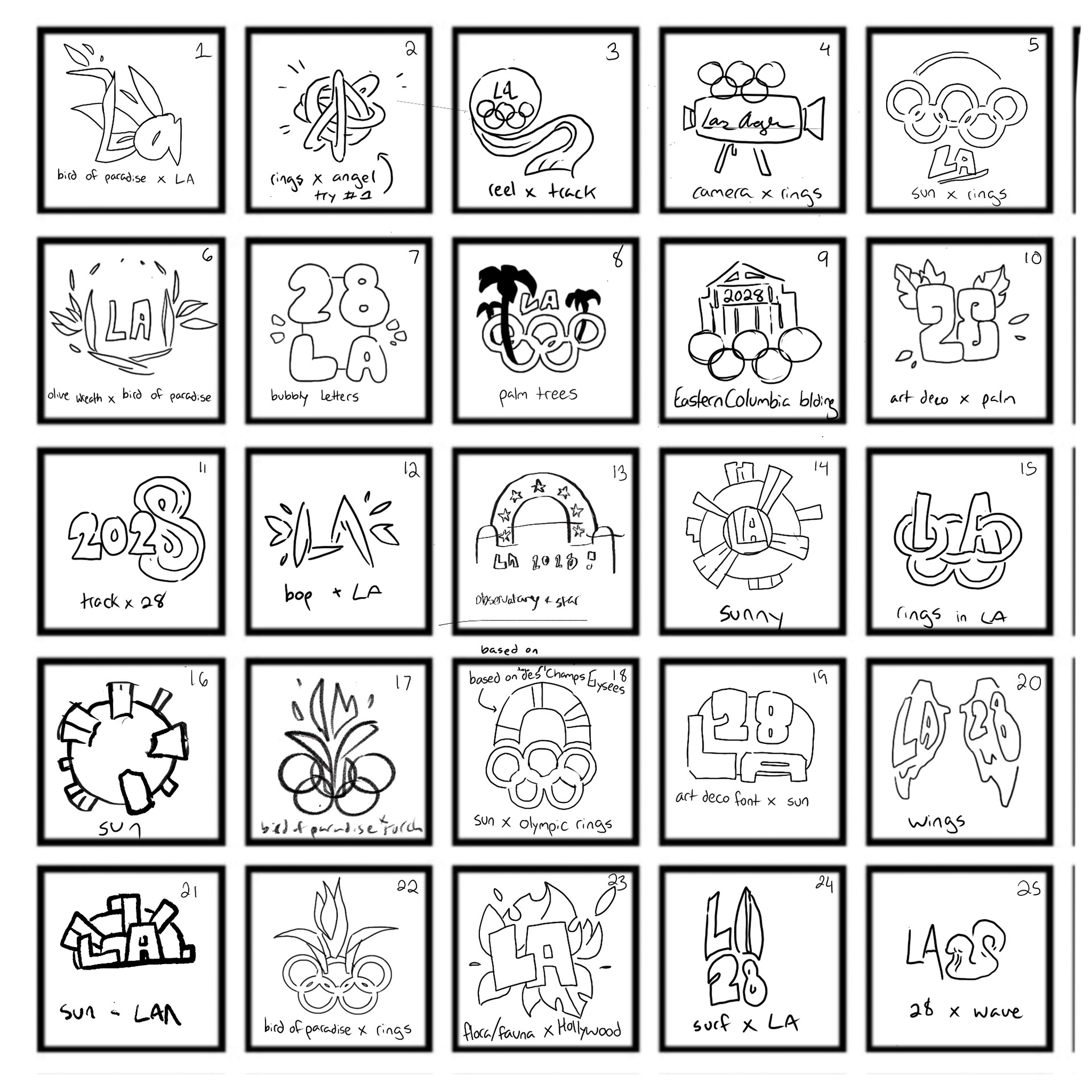
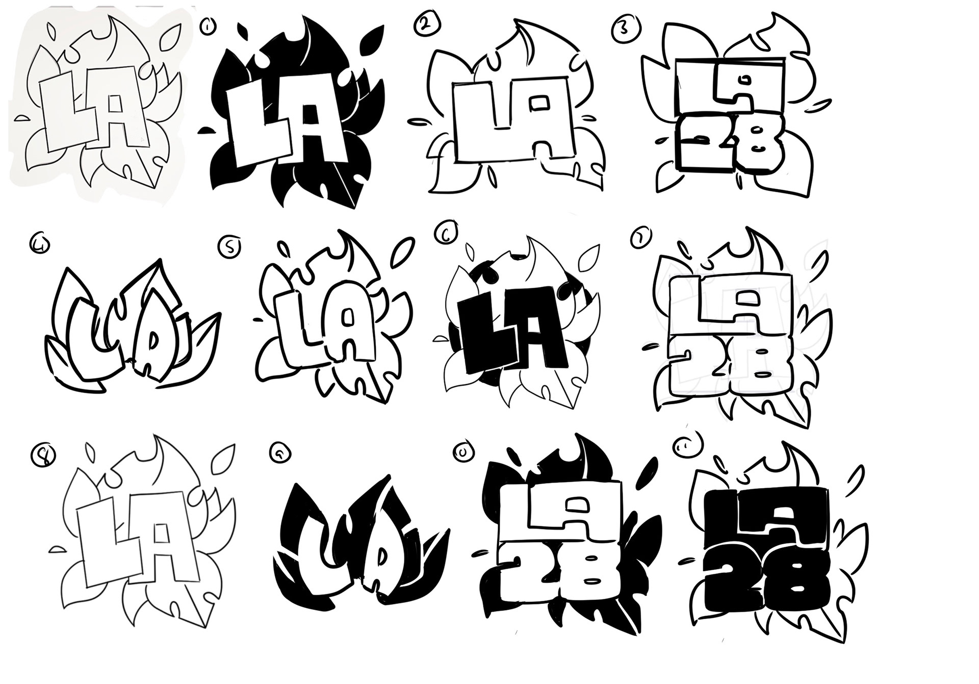
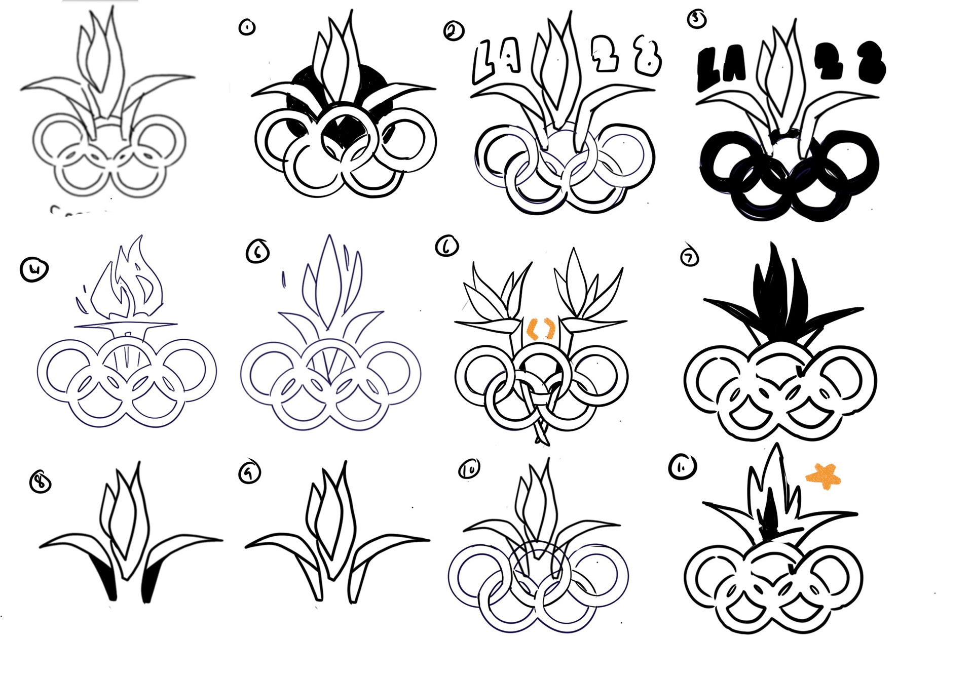
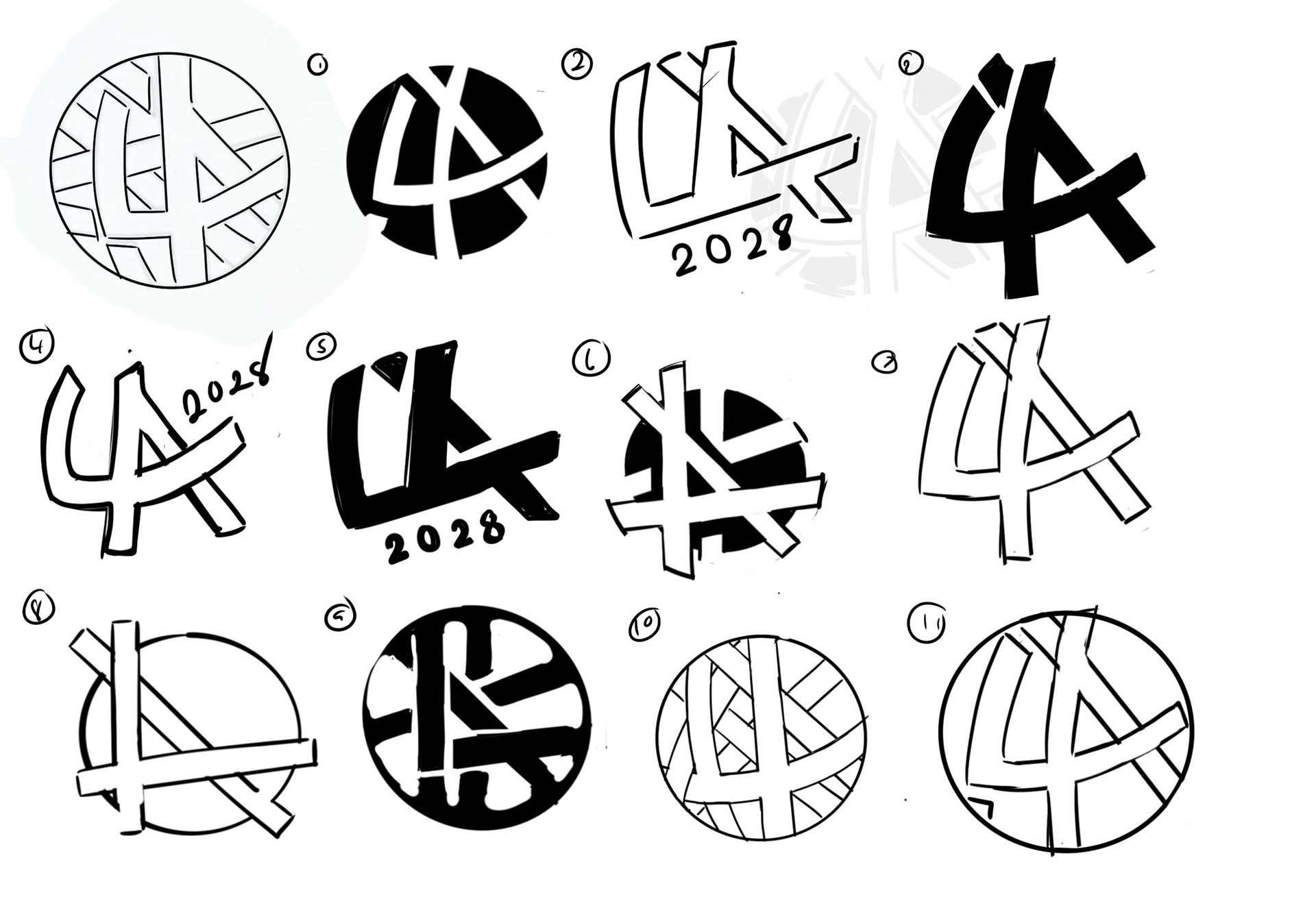
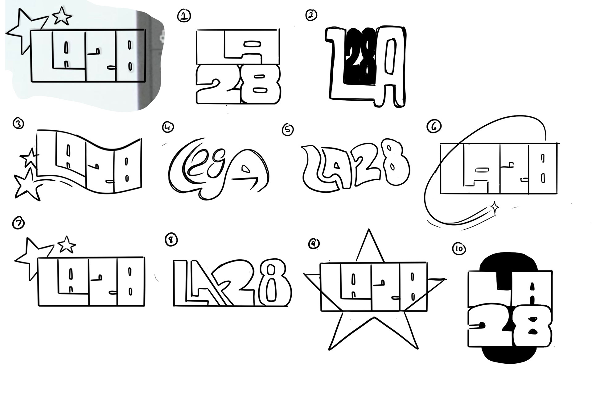
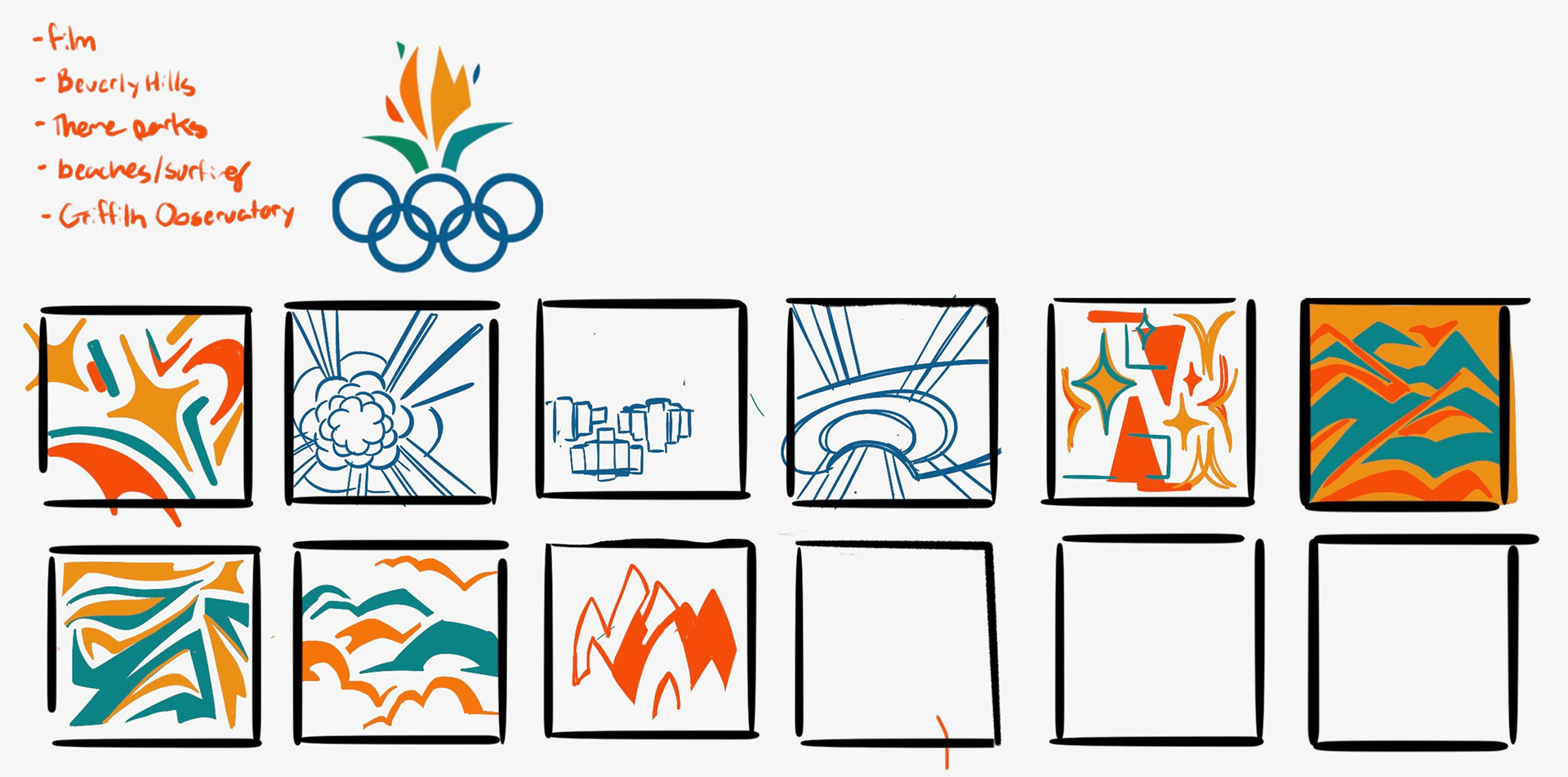
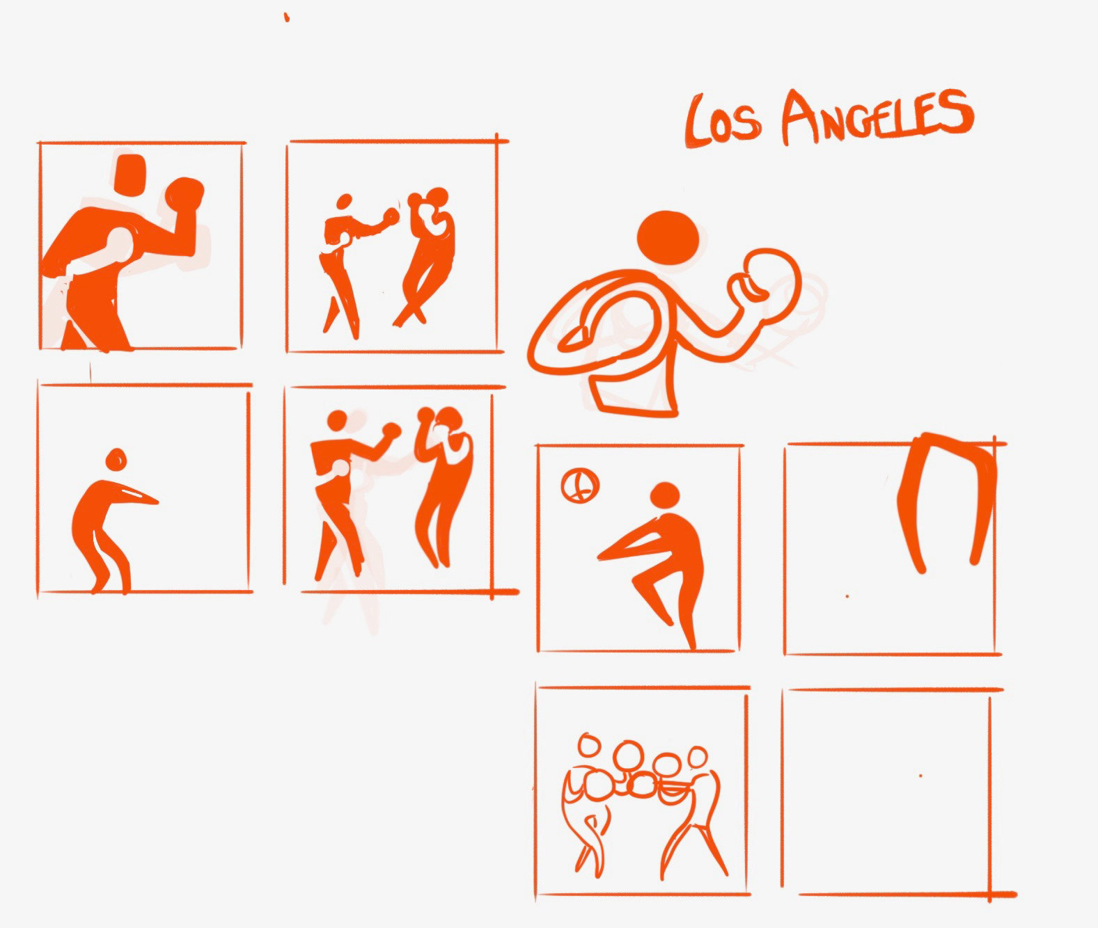
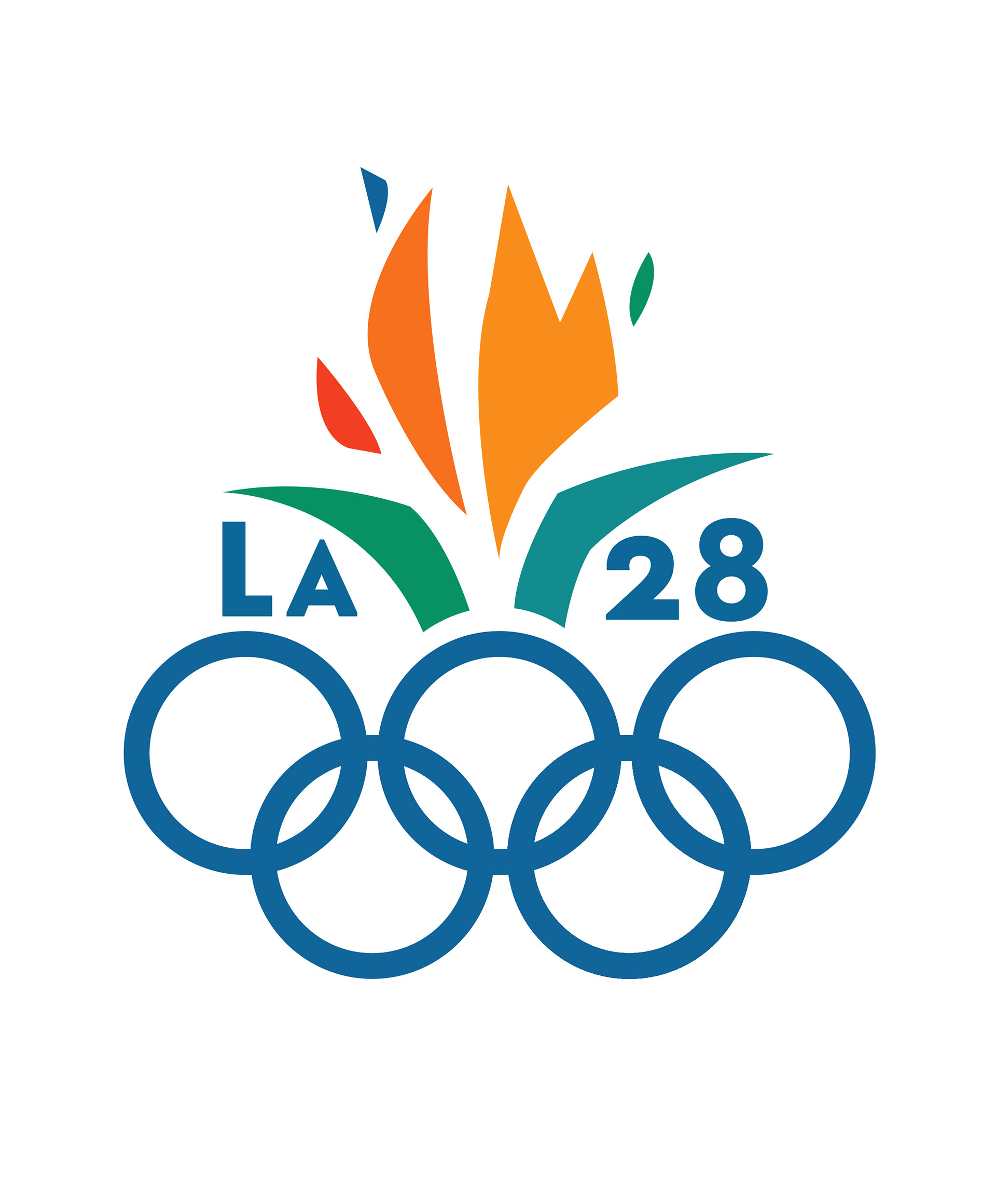
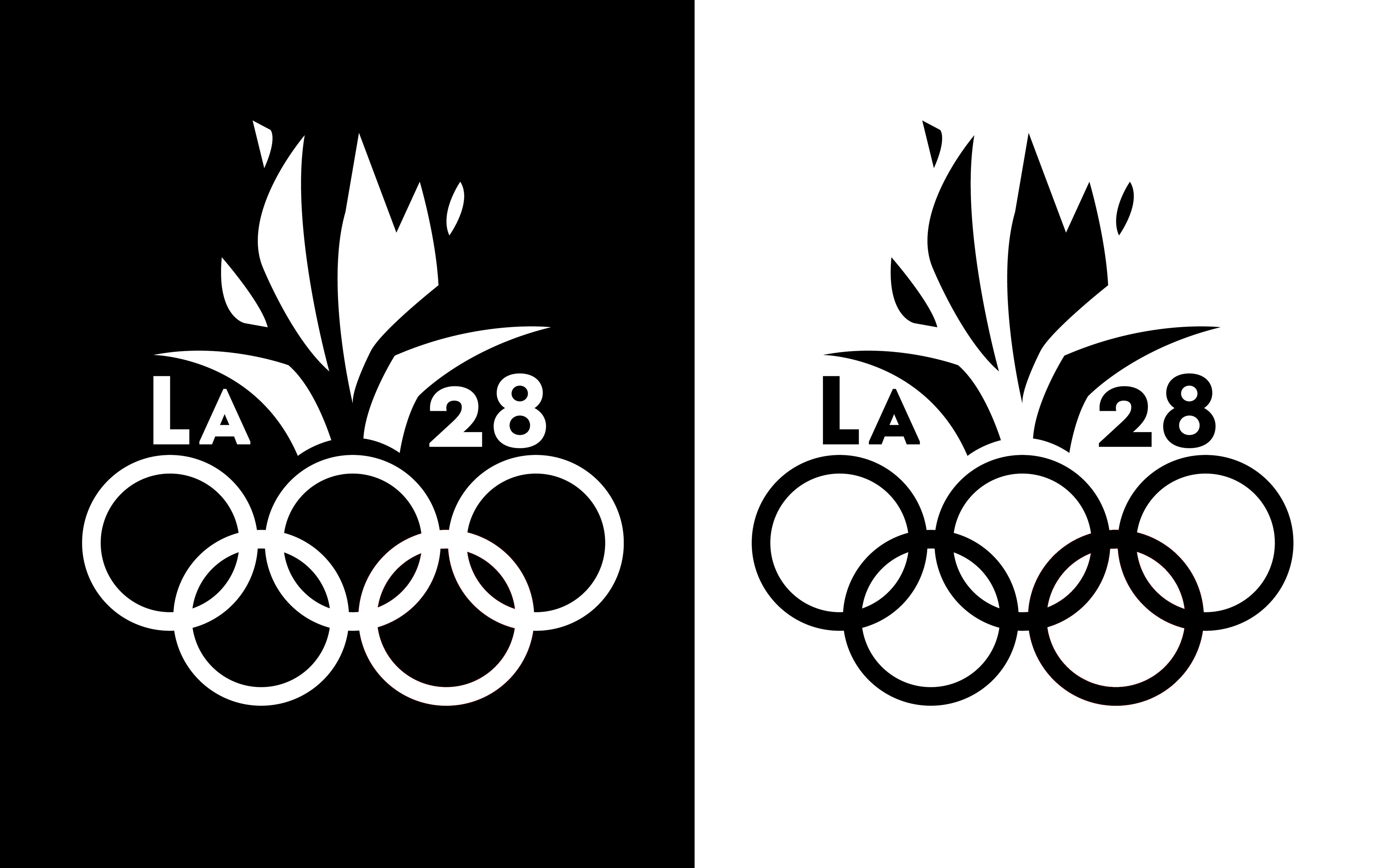
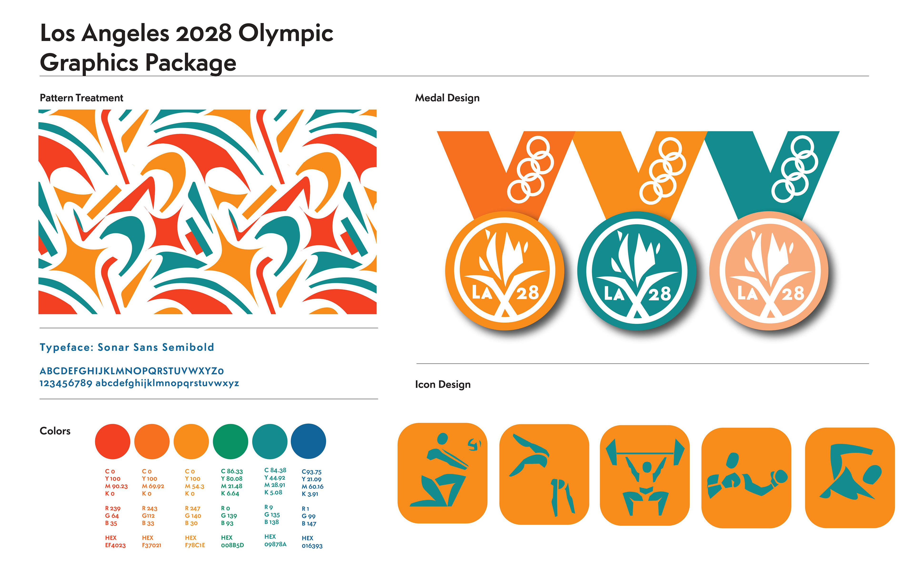
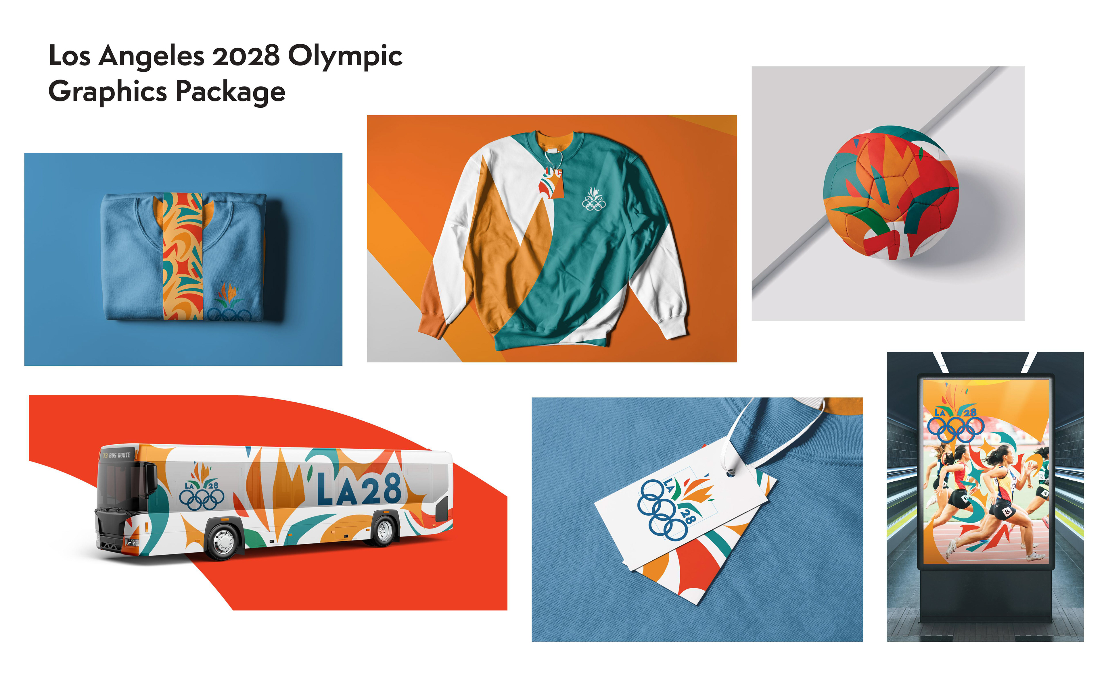
I began by sketching logo concepts, patterns, and icons while researching the history and visual identity of Los Angeles. My first ideas explored familiar imagery like Hollywood, stars, city lights, and even angelic symbolism inspired by the city's name. As I continued researching, I found myself drawn to the Bird of Paradise. Its flame-like petals offered a fresh, recognizable symbol that felt perfectly suited to the Olympic spirit. I paired the identity with a bright, bold color palette to pay tribute to the energy, diversity, and optimism that makes Los Angeles unique.