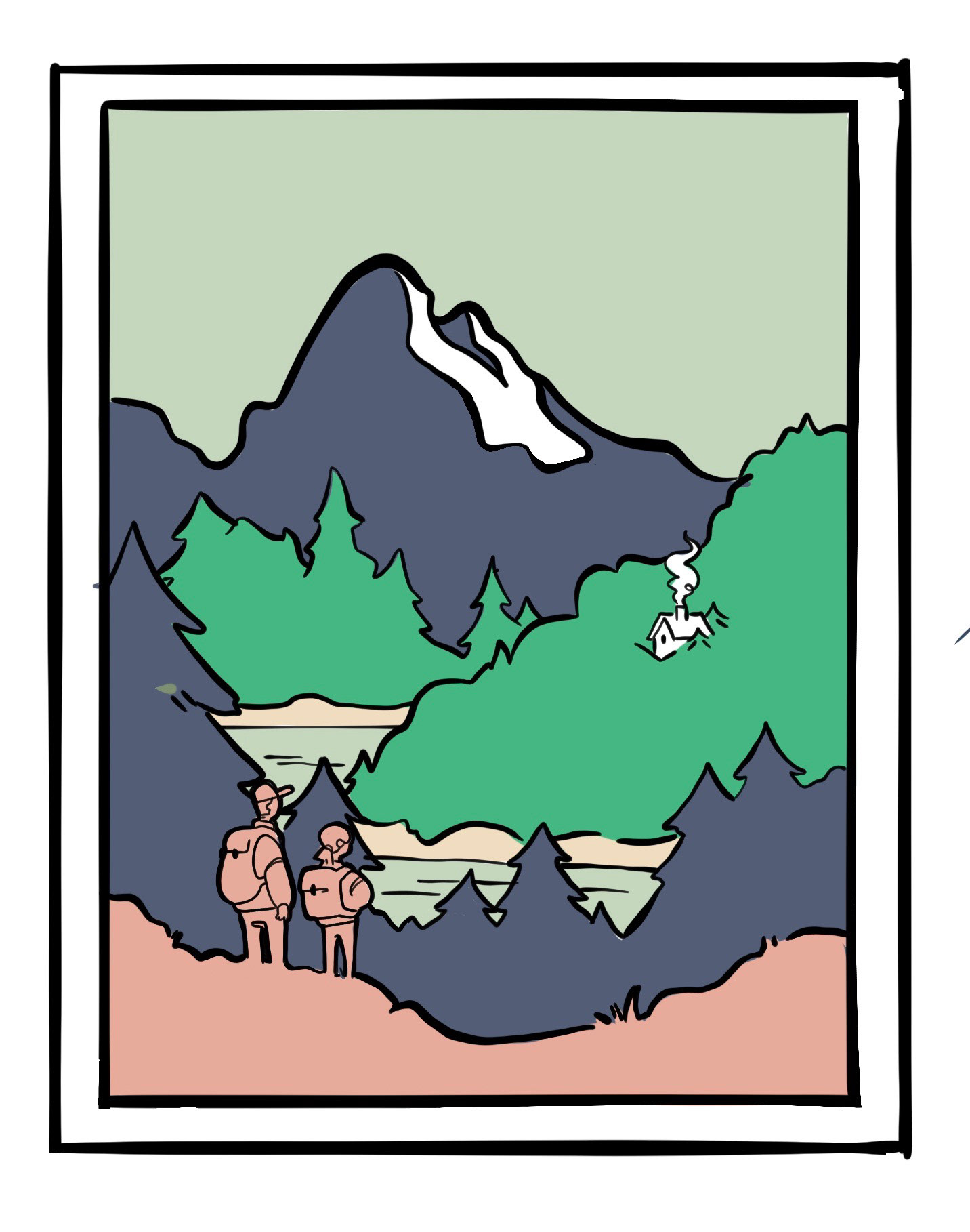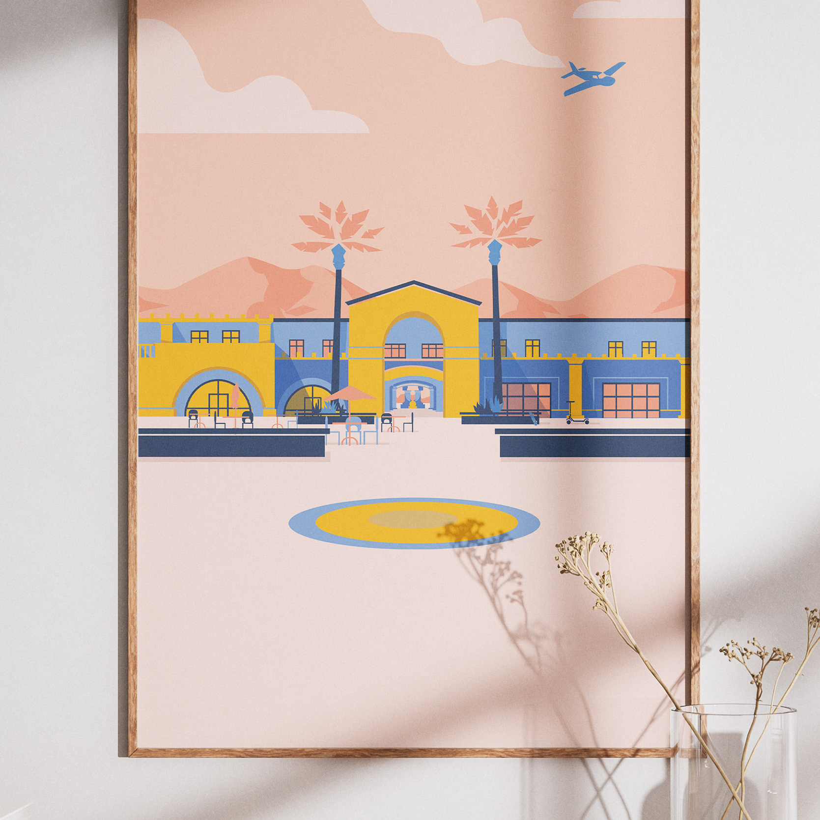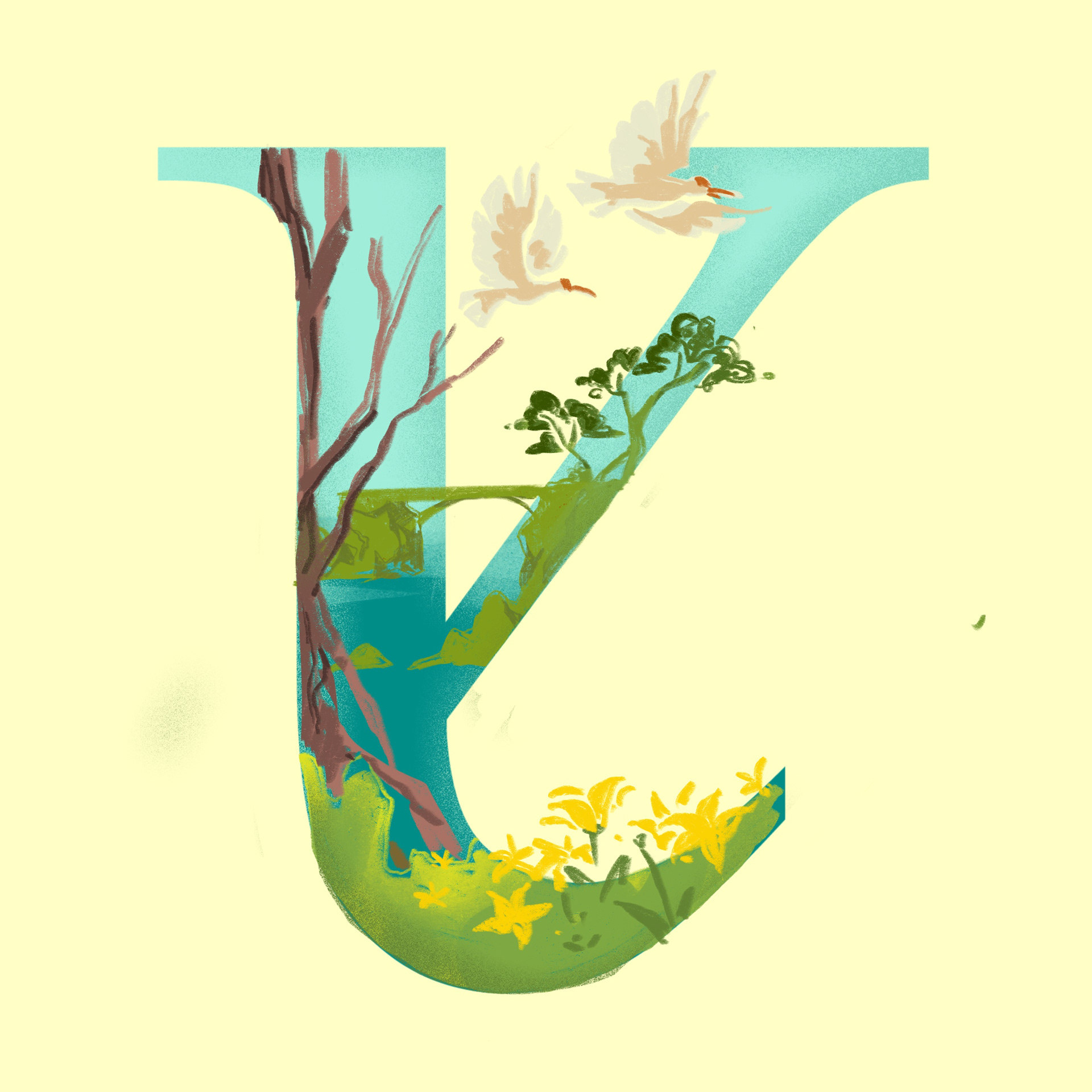


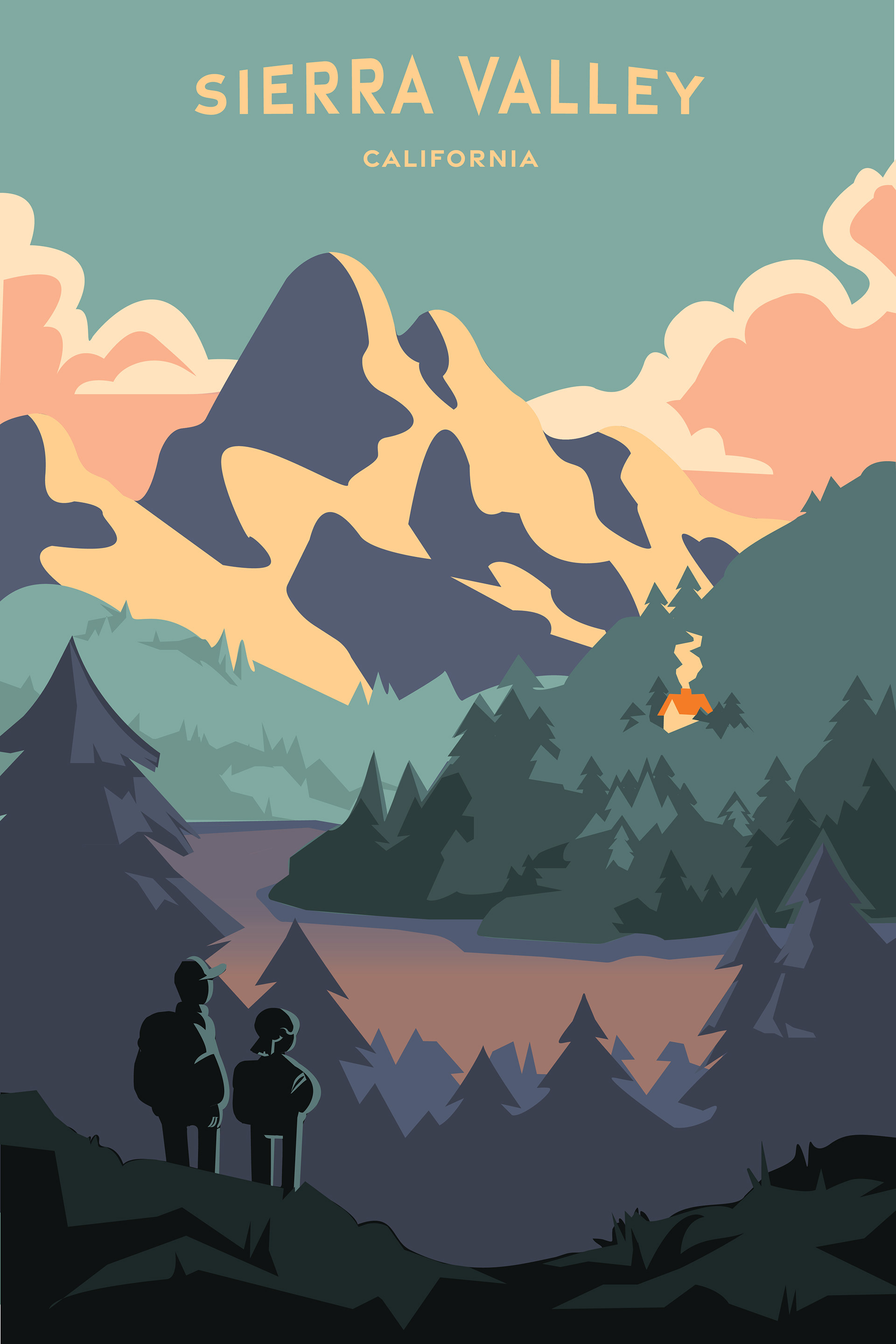
I chose pastel, muted colors to highlight the serene quiet energy the Sierras bring.
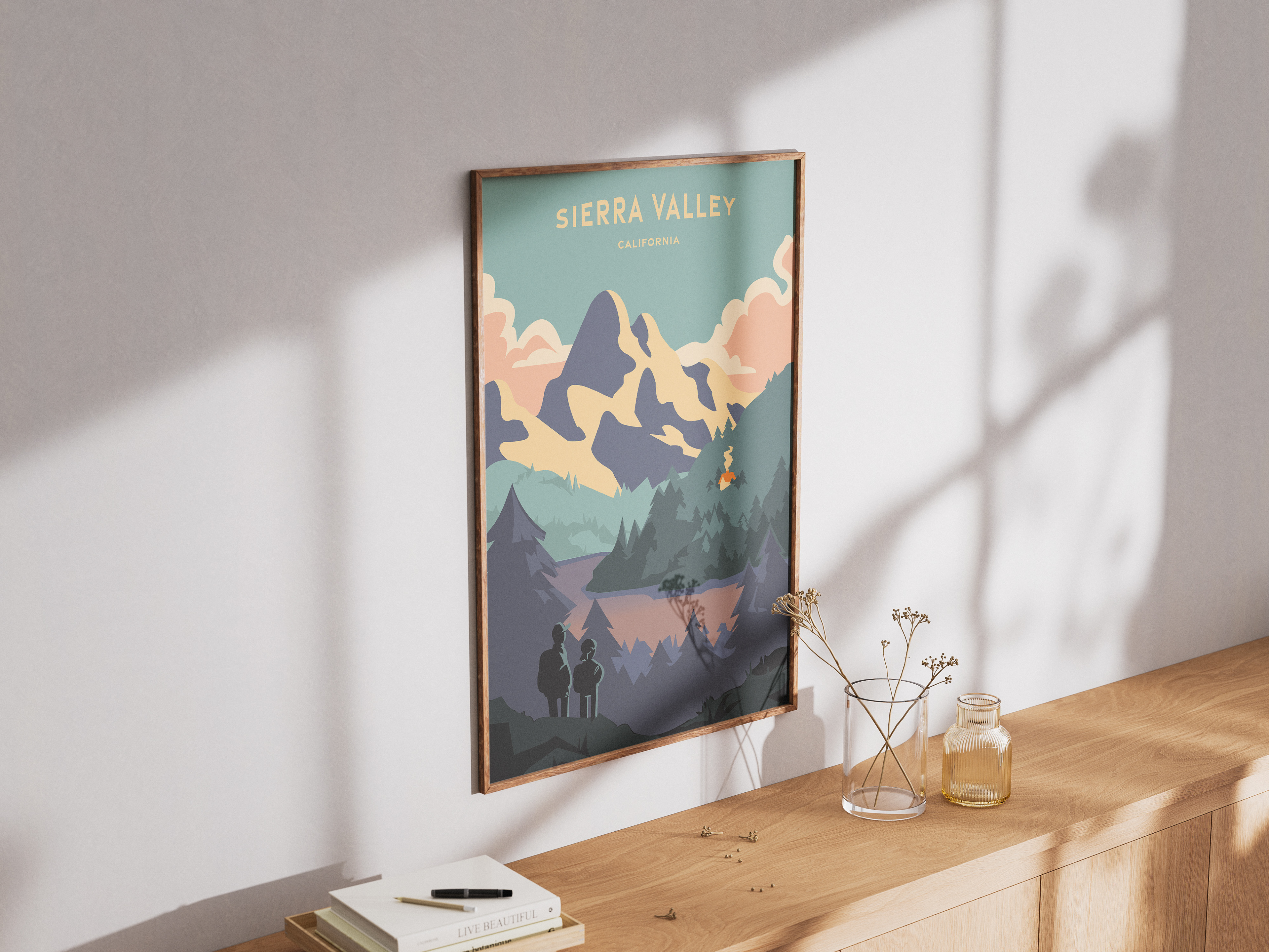
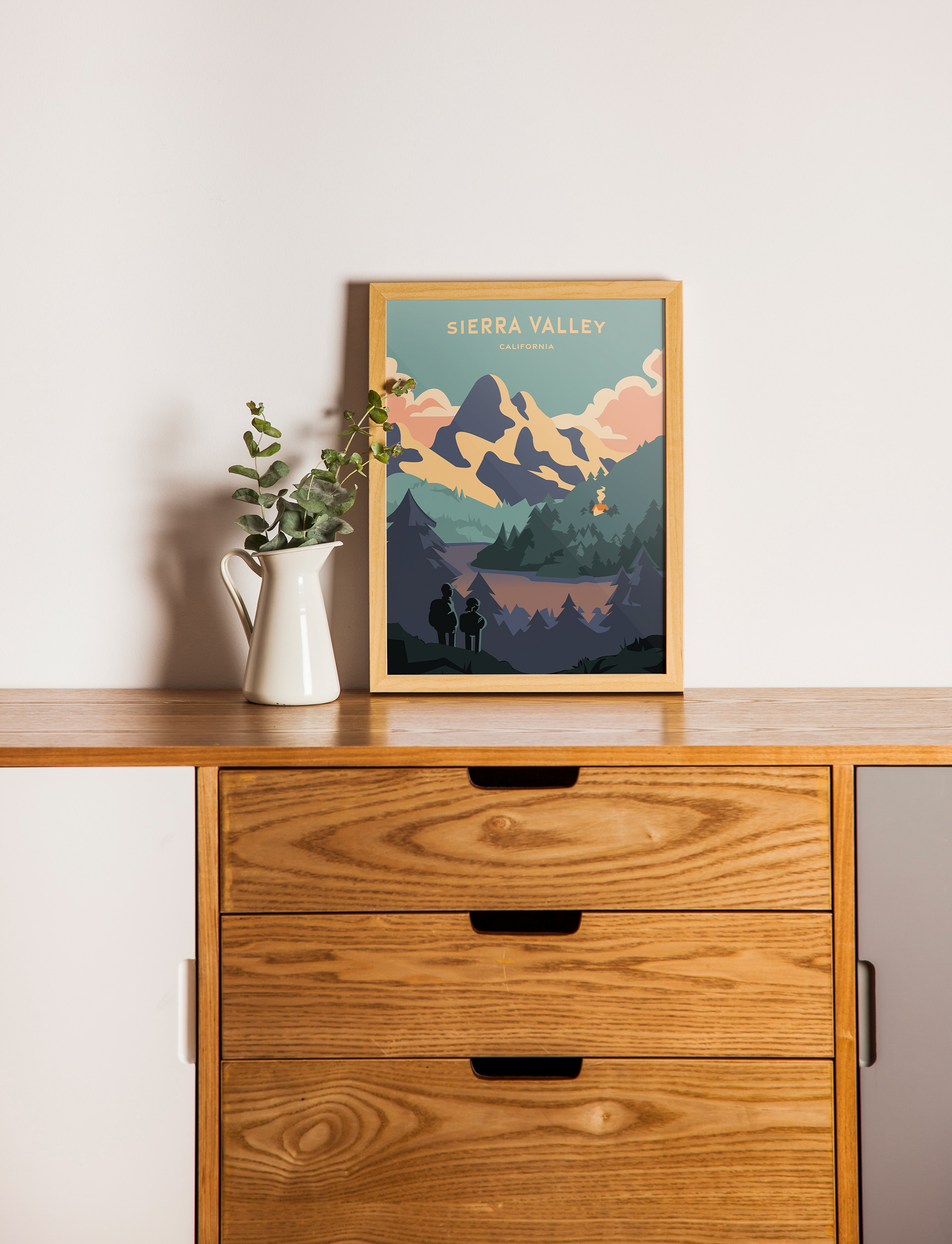
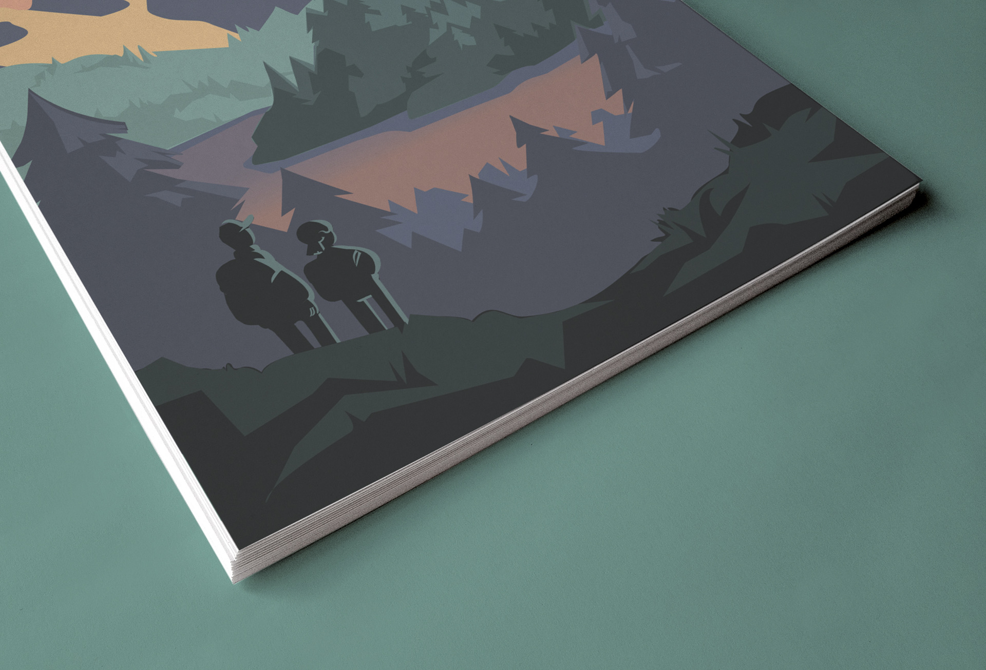

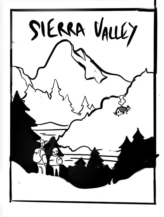
Process Pics
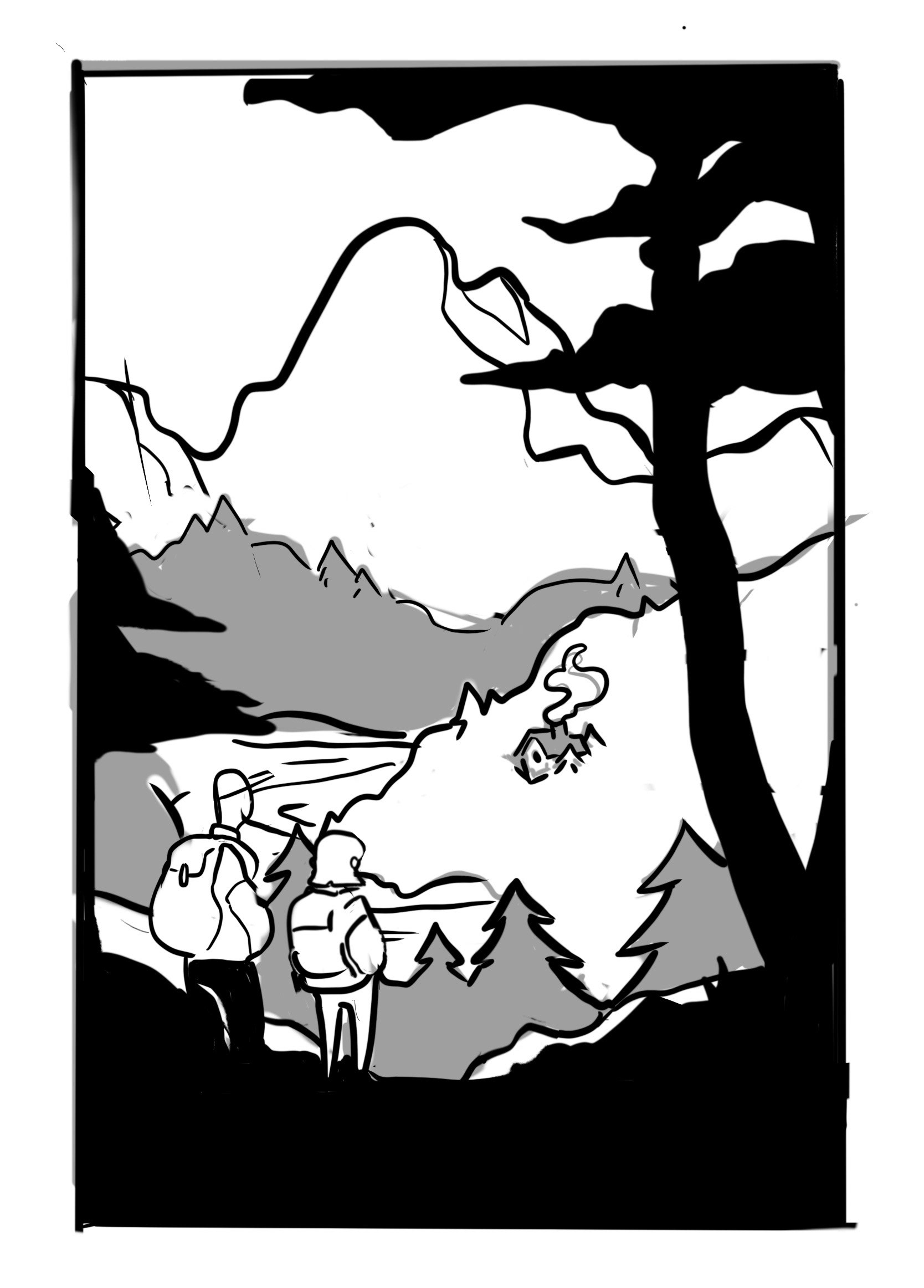
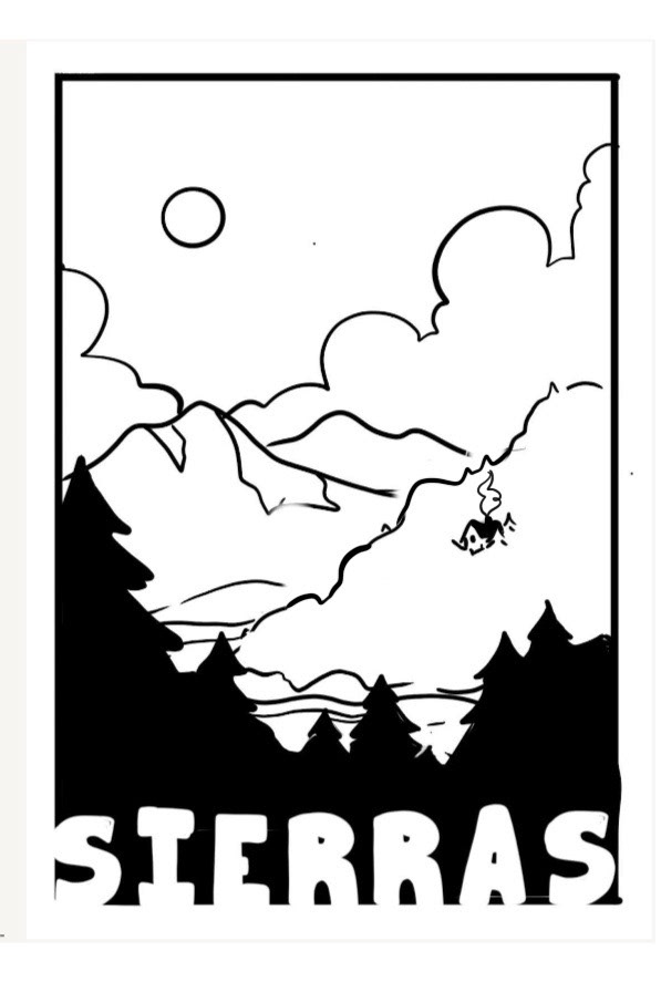
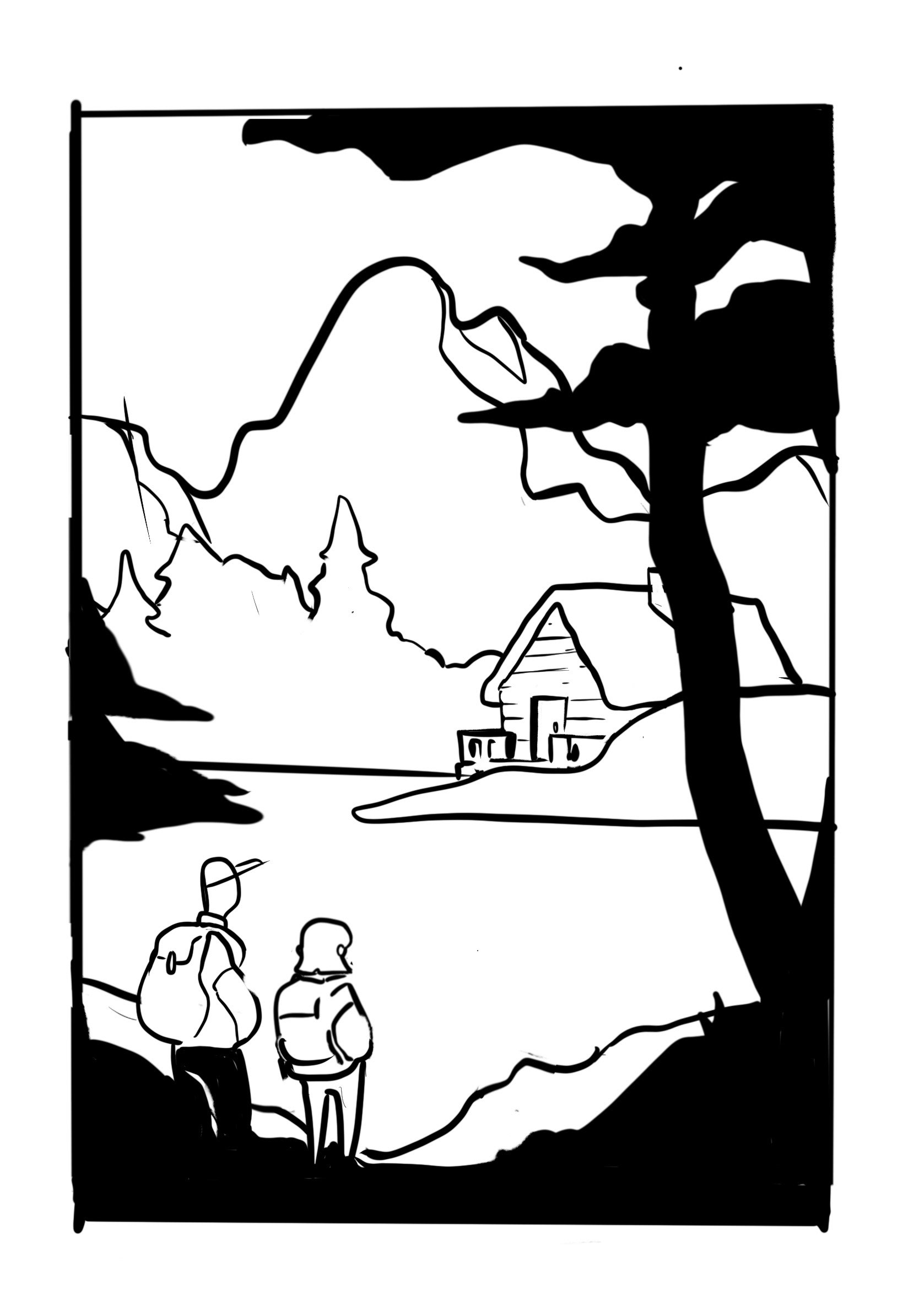
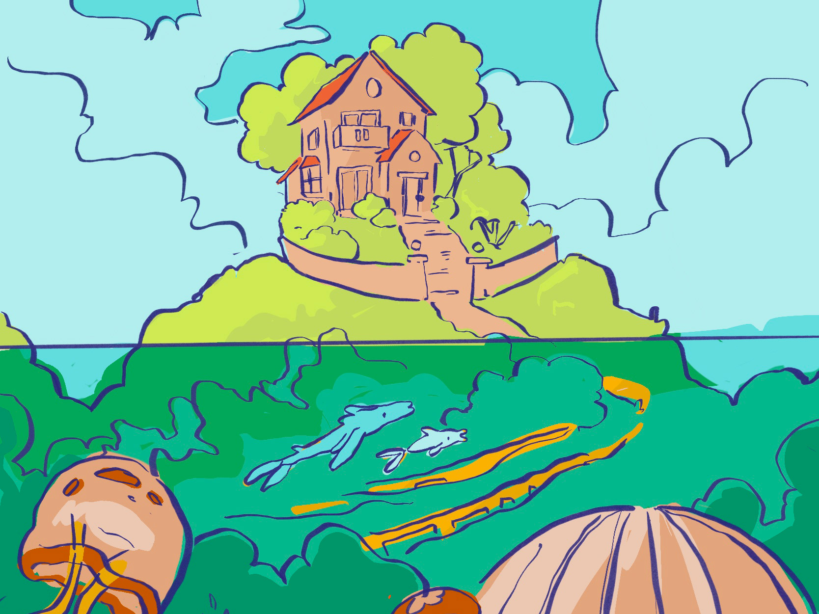
I explored different compositions by adjusting the placement of trees, figures, and landscape elements to emphasize the vast scale of the mountains and forests. For the color palette, I pushed brighter, more saturated tones into the distance to guide the viewer’s eye through the landscape and make the environment feel expansive. I ultimately settled on a cool, desaturated palette to capture the quiet, peaceful atmosphere and slow-moving feeling of the valley I grew up in.