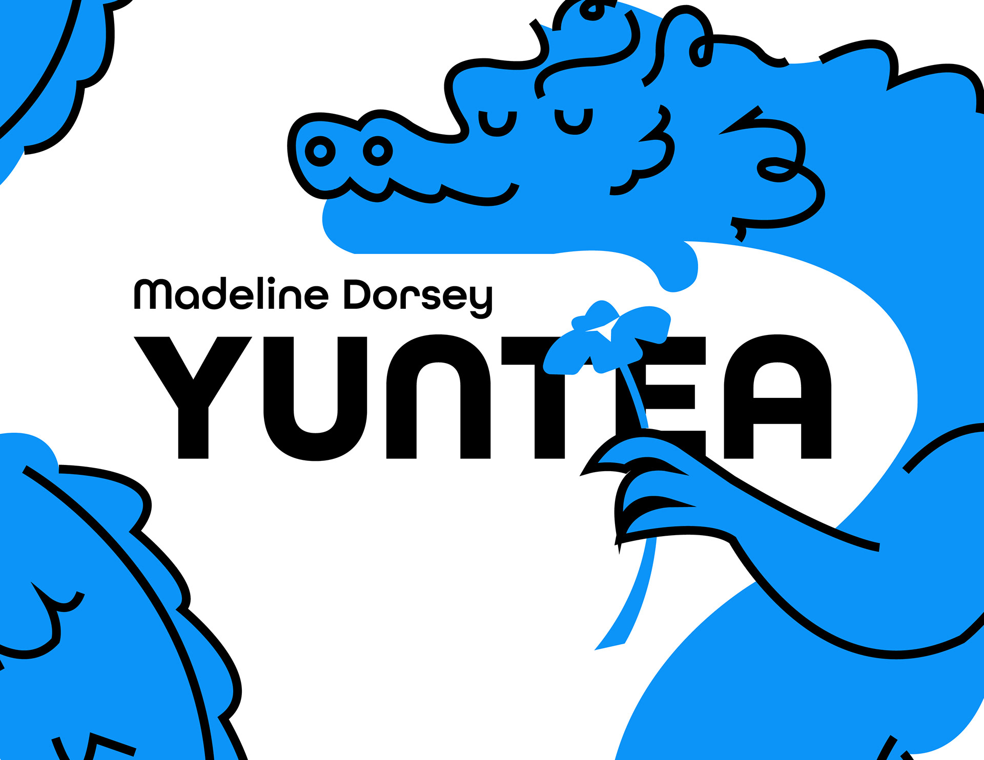
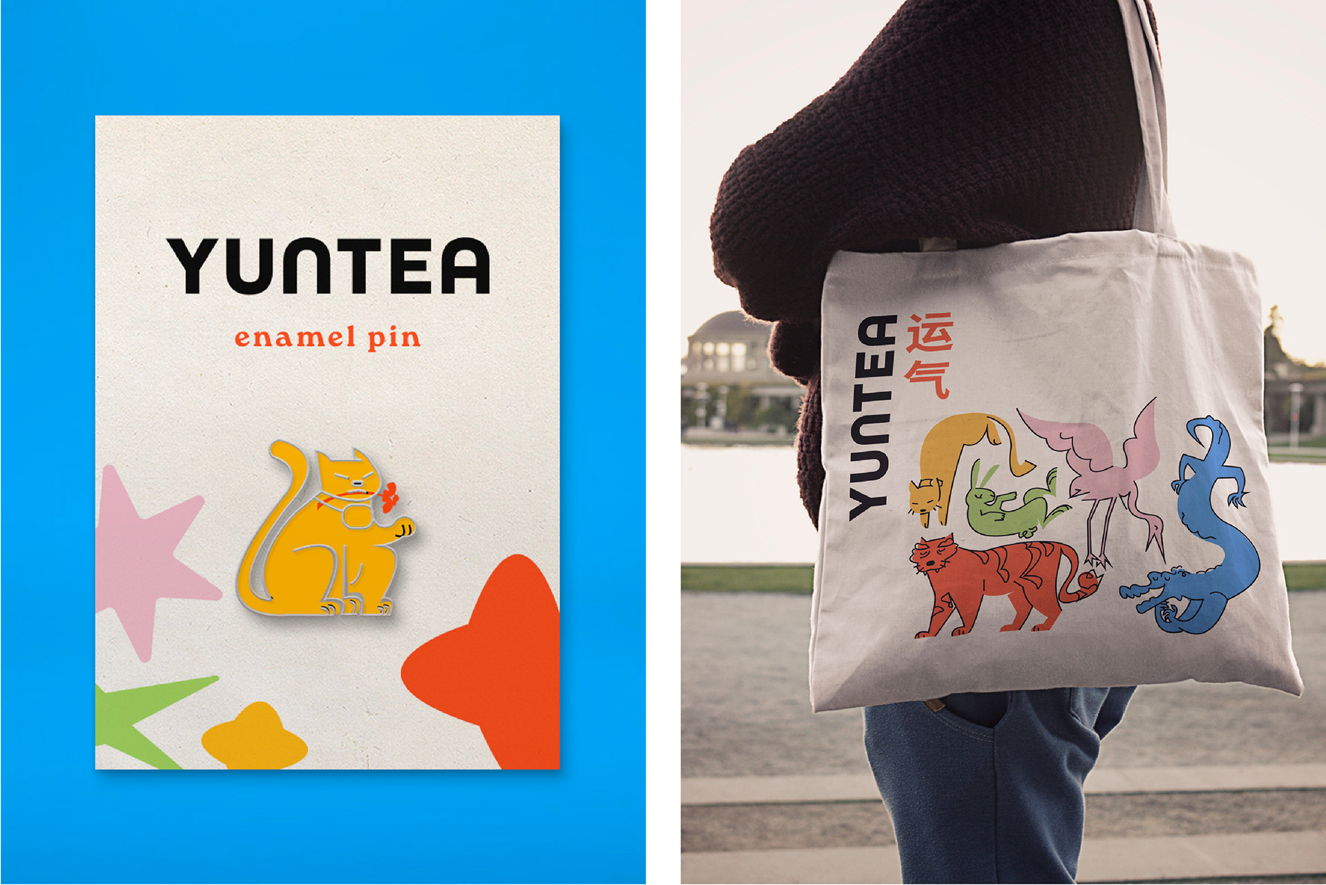
I wanted the identity to feel playful, welcoming, and easy to recognize. All Round Gothic became the primary typeface because its soft, rounded forms pair naturally with the illustrations, while Roca Bold provides a warm, expressive contrast for supporting text. Together, they create a friendly visual system that feels both modern and approachable.
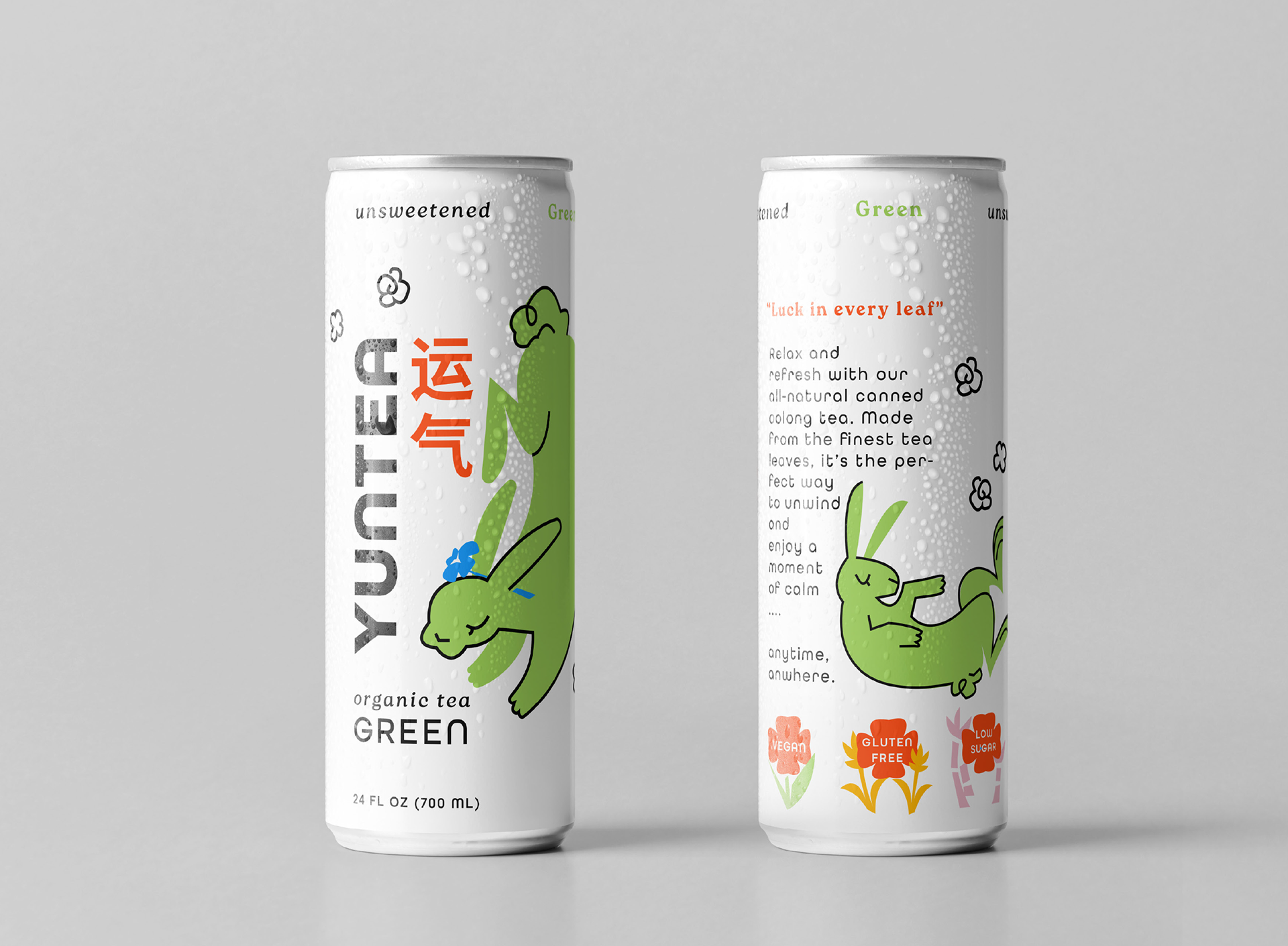
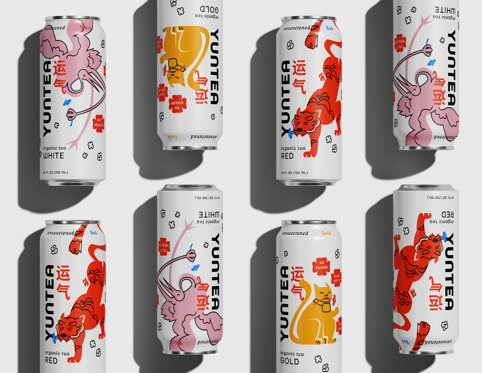
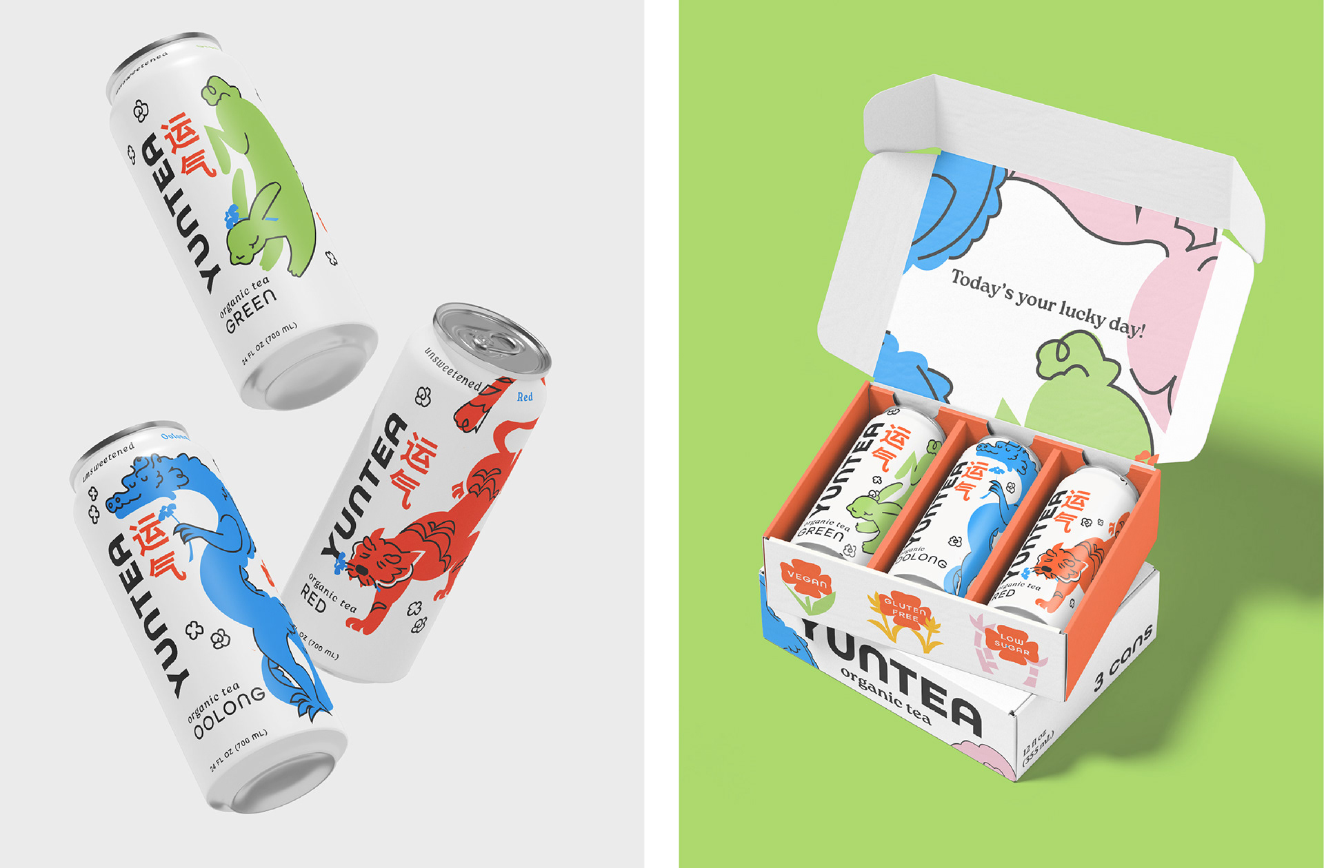
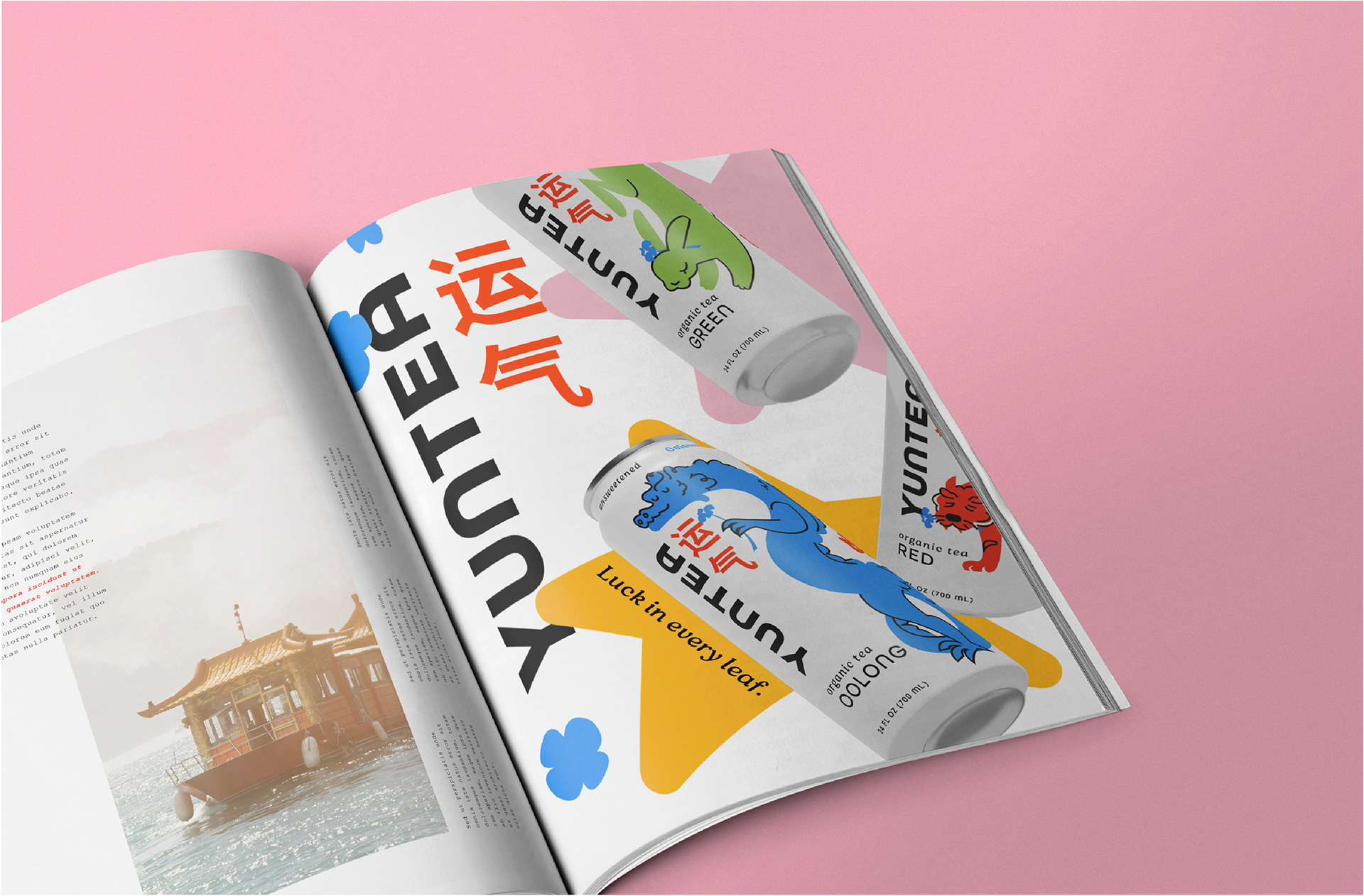
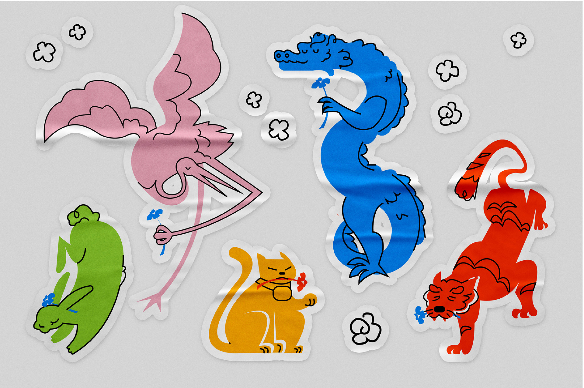
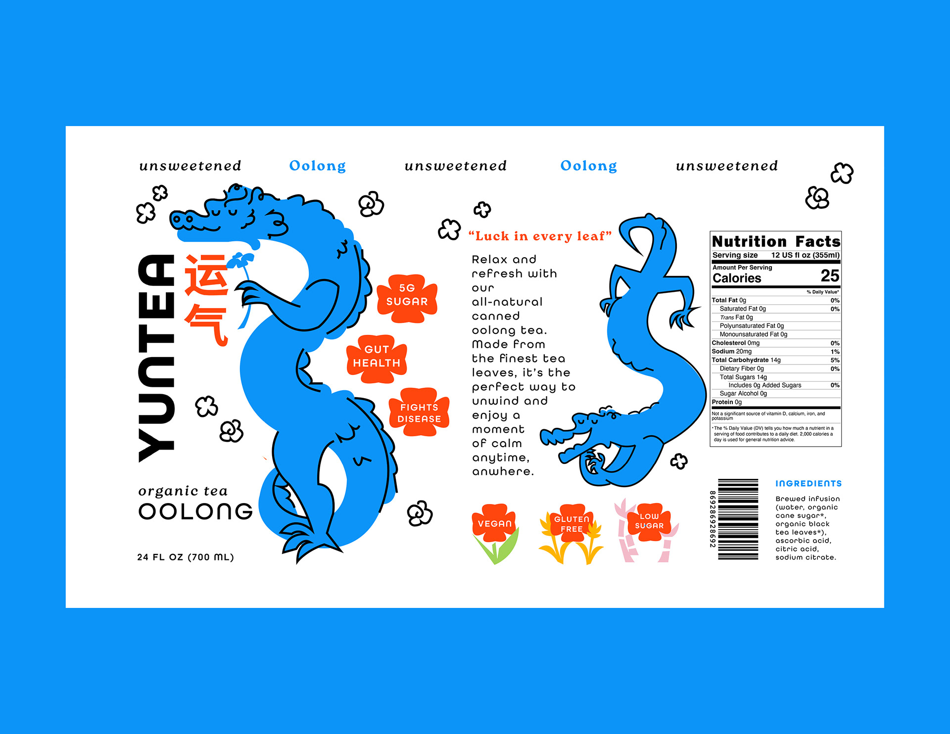
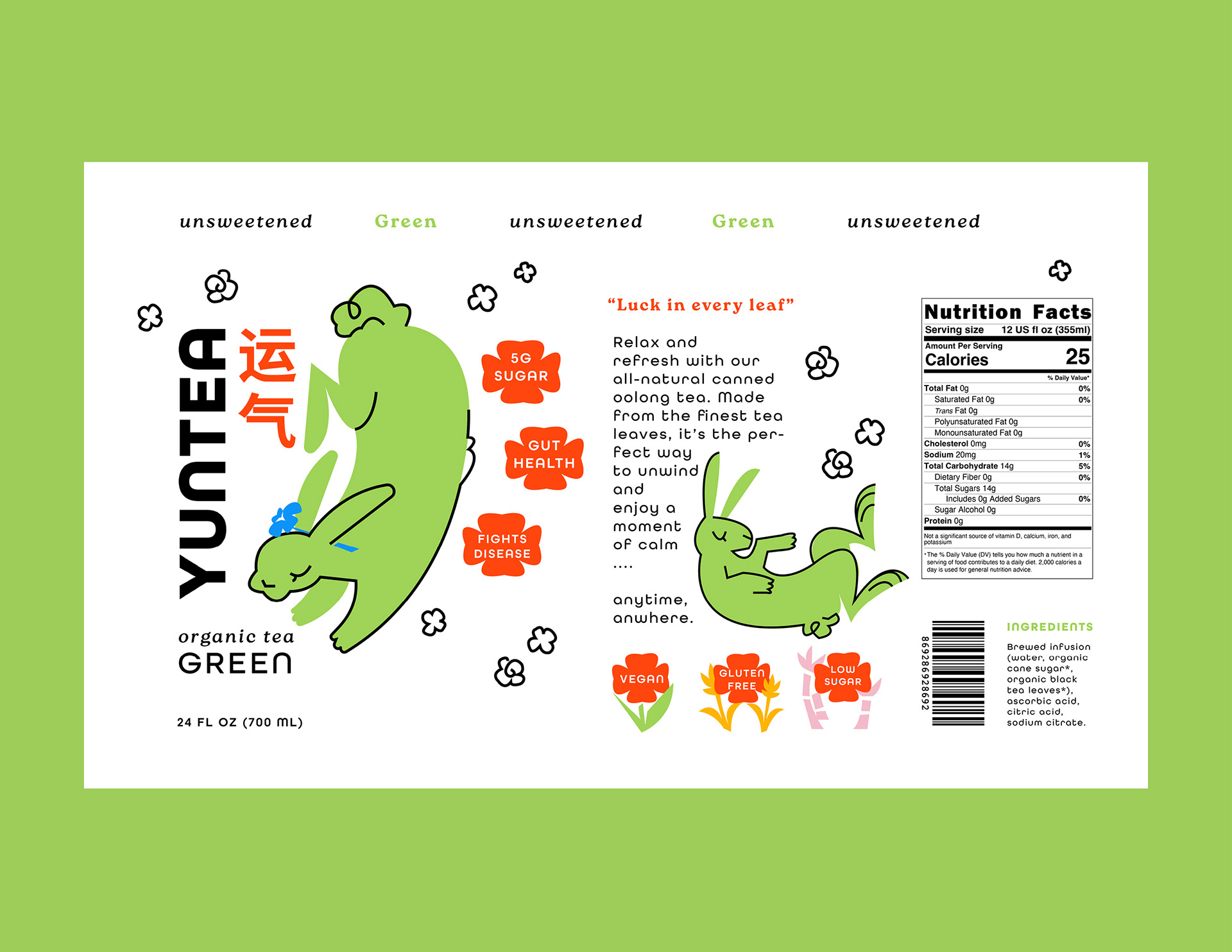
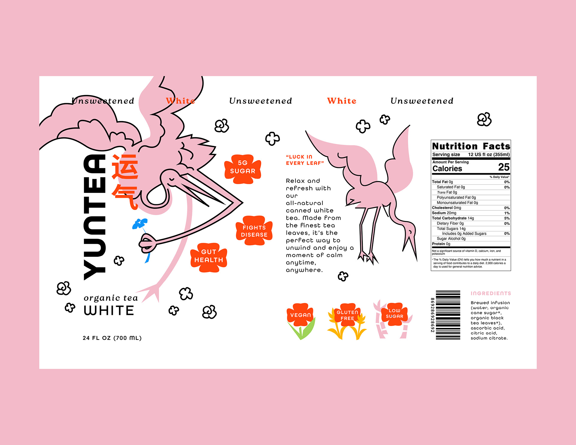
Each flavor features an illustrated mascot inspired by an animal significant in Chinese culture. I researched the symbolism behind each animal and matched its characteristics to the intended benefits of the tea, creating a collection where every blend has its own distinct personality while still feeling part of the same family.
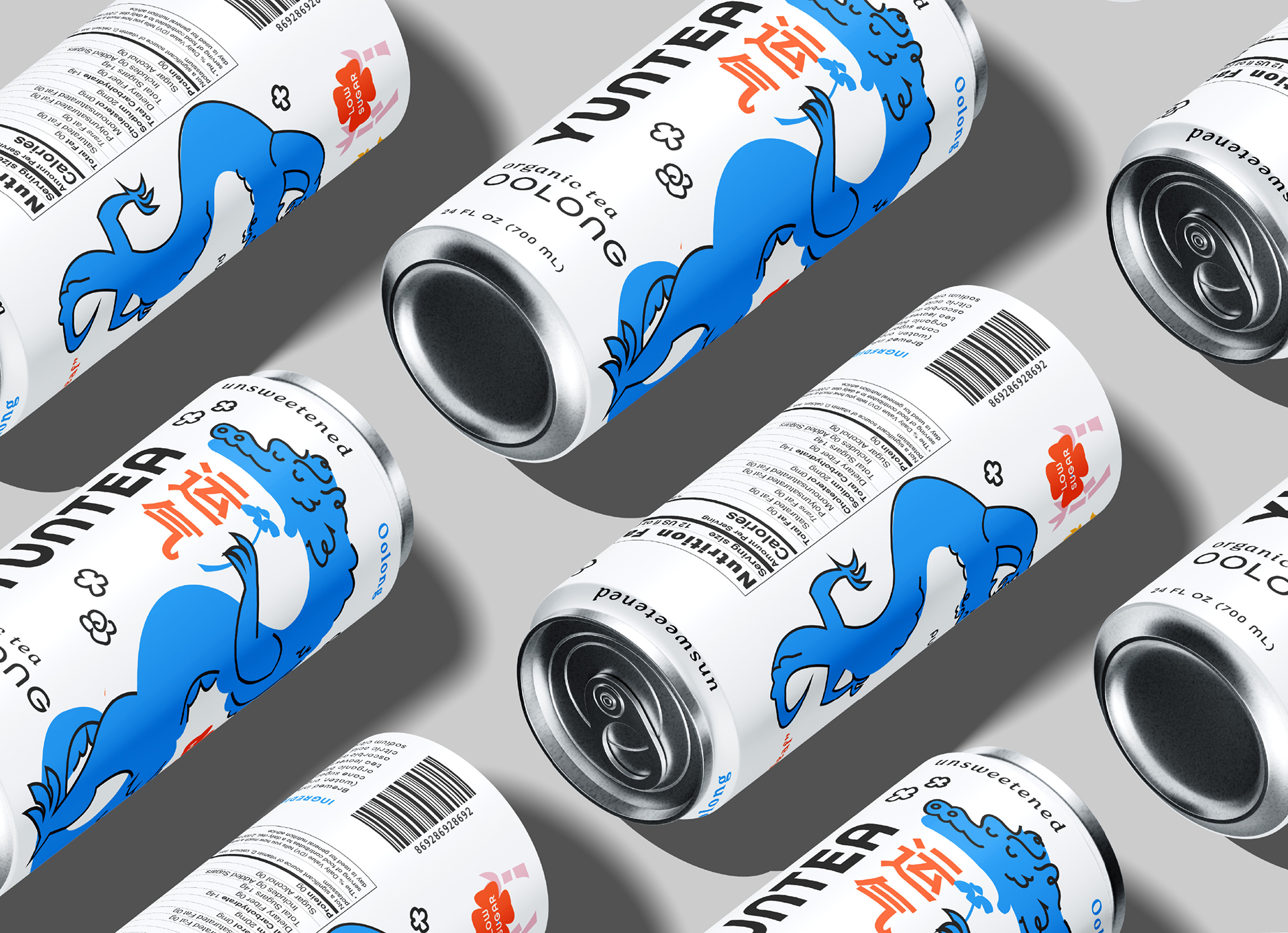
Packaging and Advertising
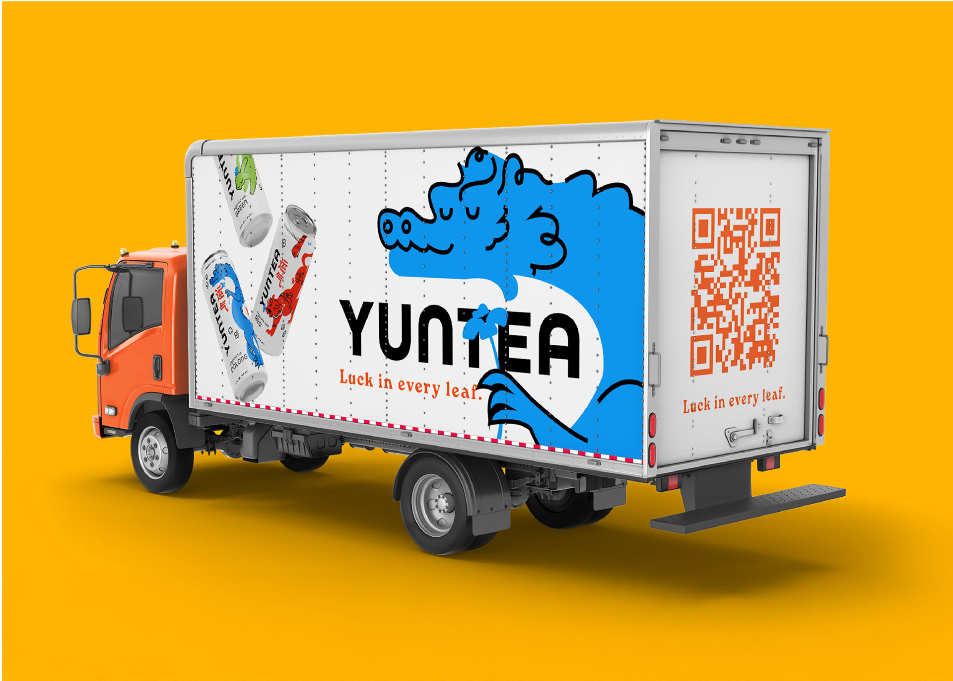

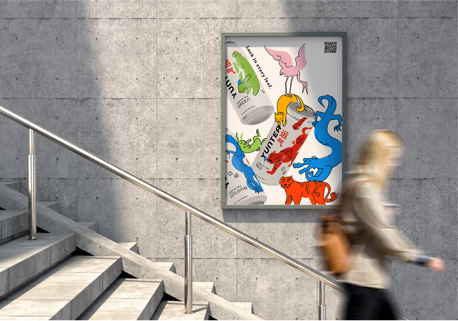
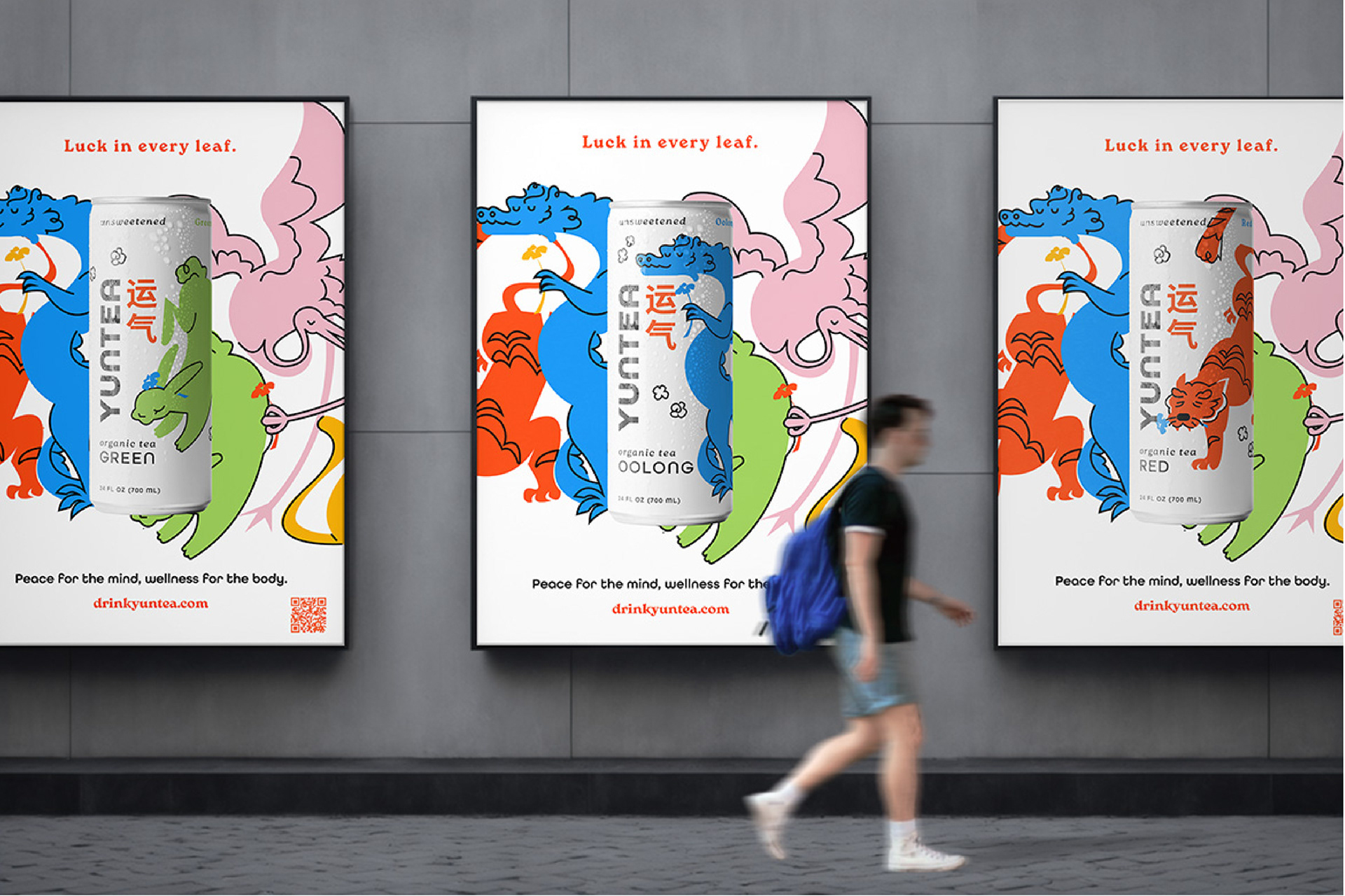
Can Spreads


Cultural Background and Exploration:
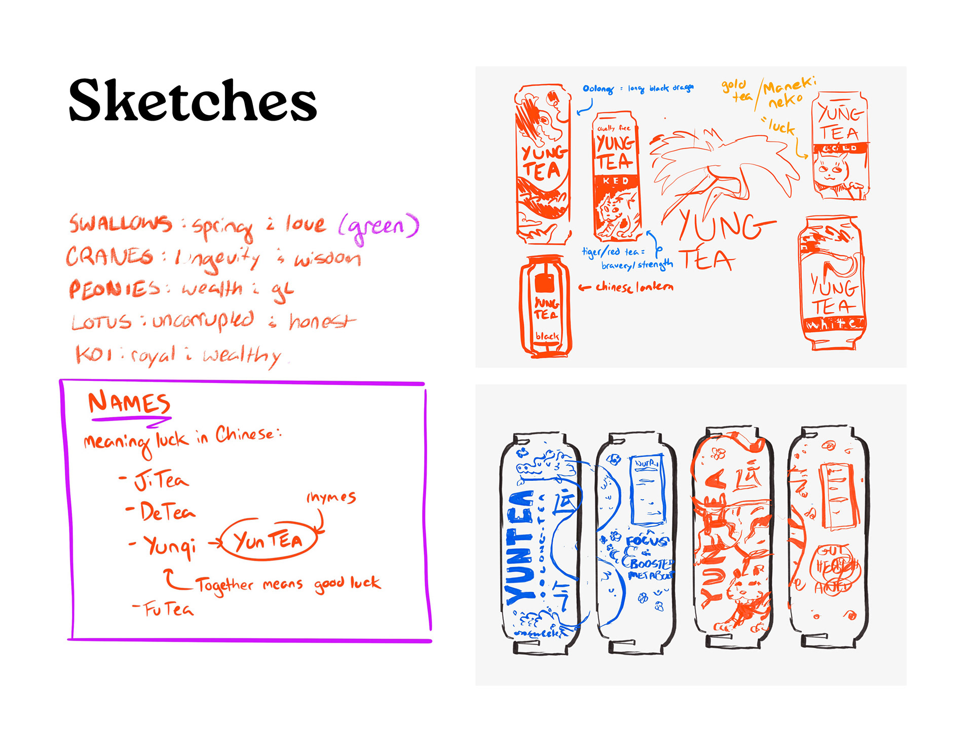
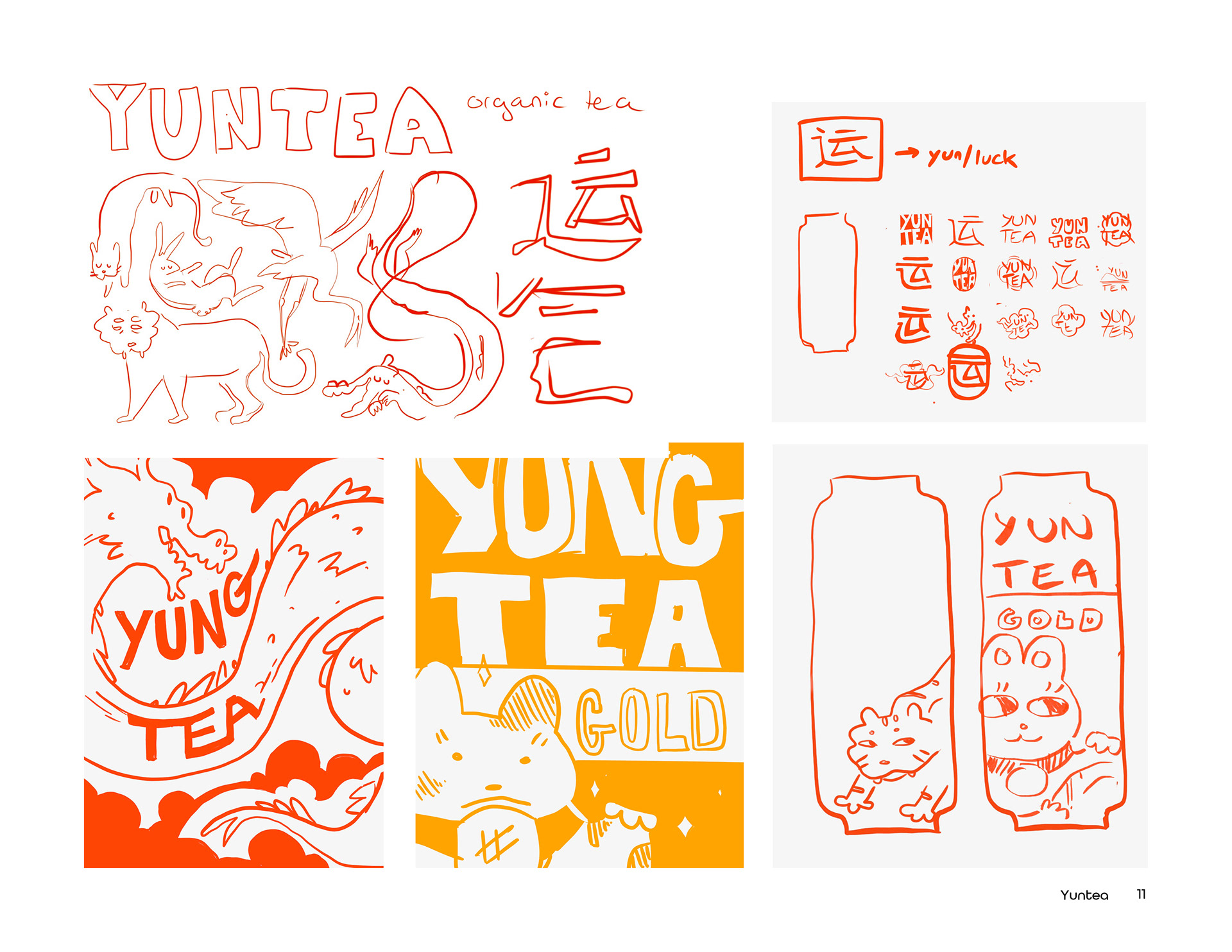
Before sketching, I researched the history and wellness benefits of each tea alongside Chinese symbolism and traditions. This exploration helped shape the brand name, informed the use of Chinese characters within the logo, and guided the development of each mascot through pages of concept sketches and visual studies.
Visual Identity Development
I explored a variety of typefaces before landing on All Round Gothic, whose soft geometry felt like a natural extension of the illustrations. Roca Bold supports the identity with expressive headlines and clear hierarchy.
Each flavor has its own palette, but red ties the collection together. Used throughout the Chinese characters and key accents, it symbolizes luck and prosperity—a nod to the meaning behind Yunqi.