Process Pics:
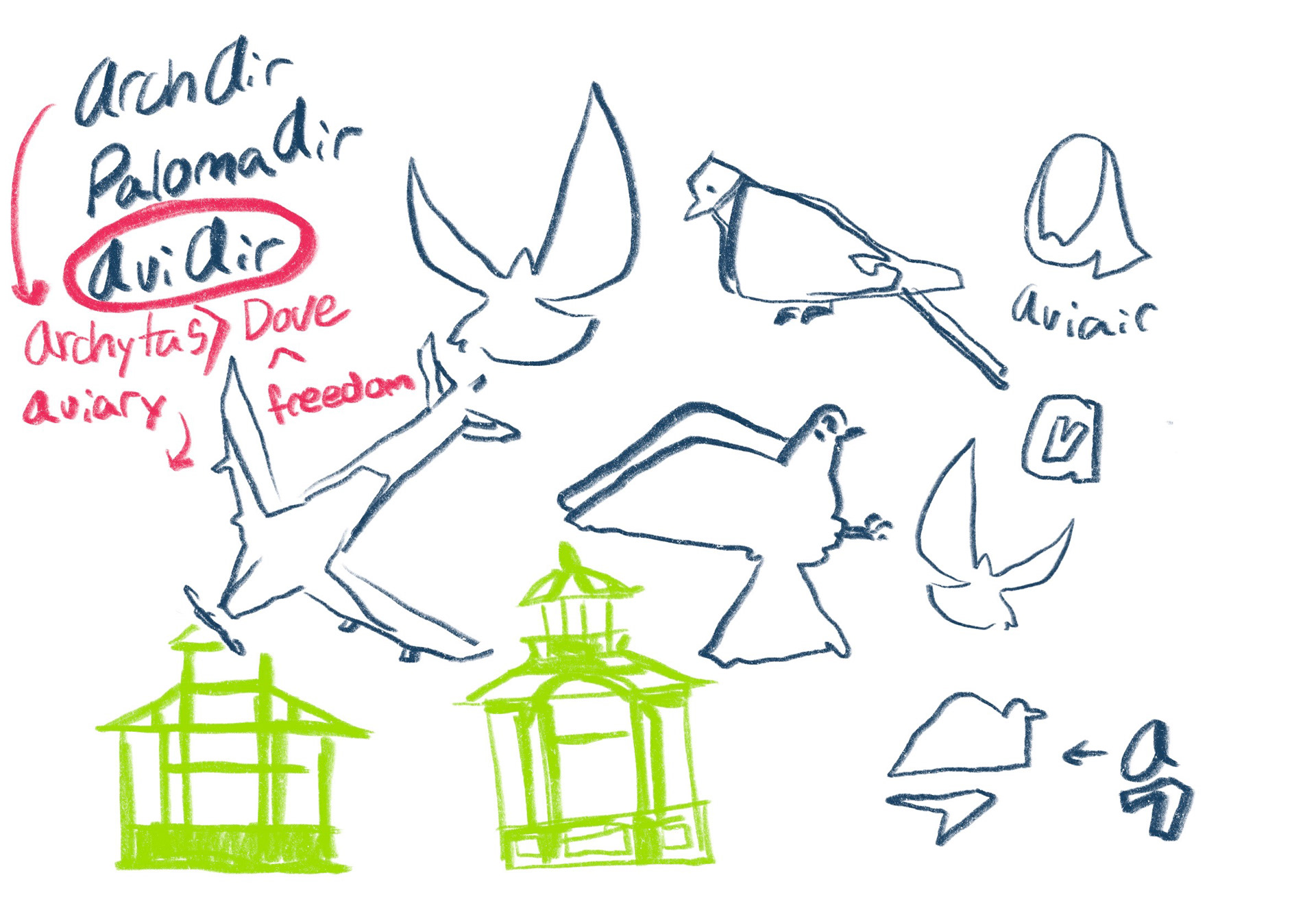
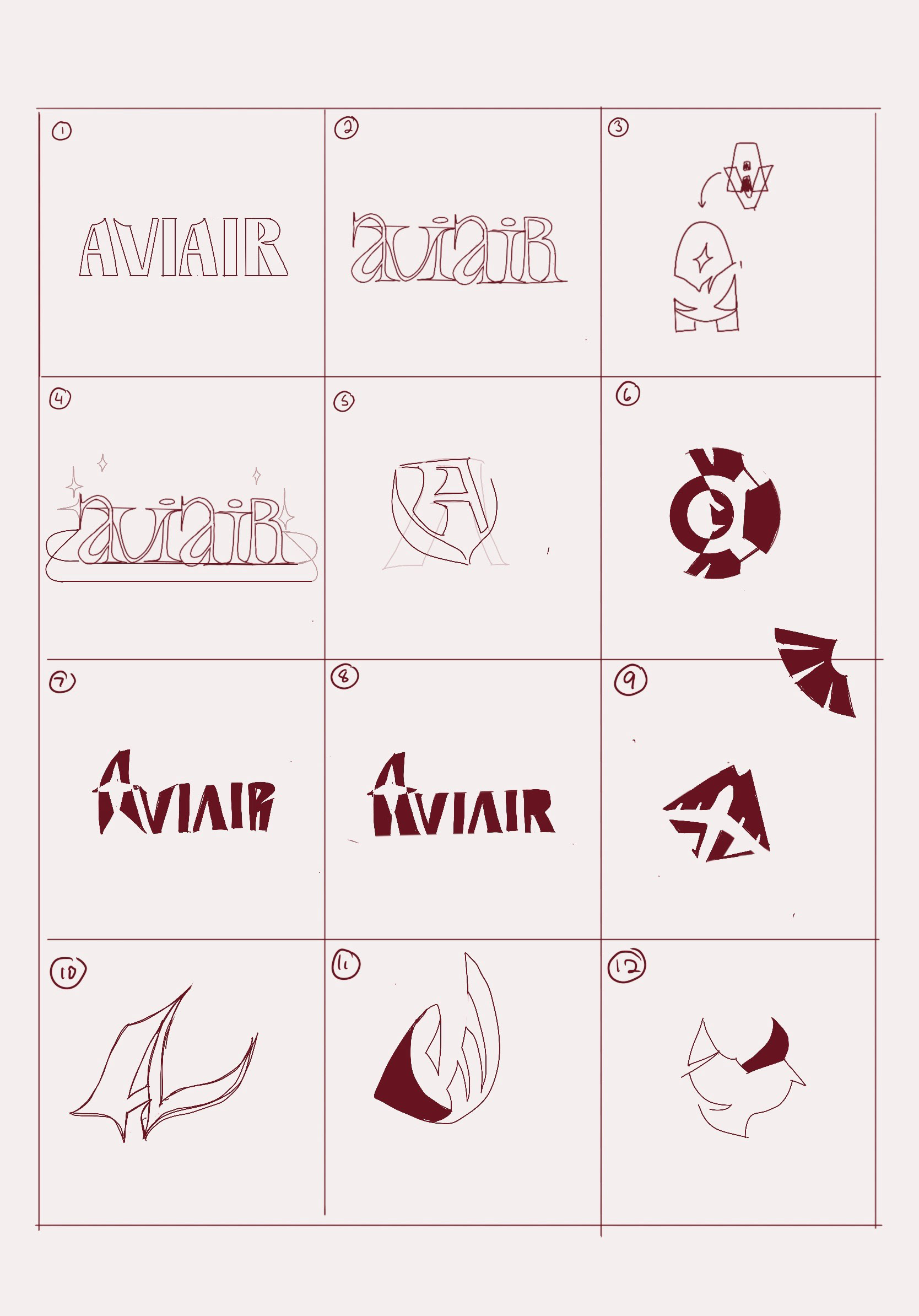
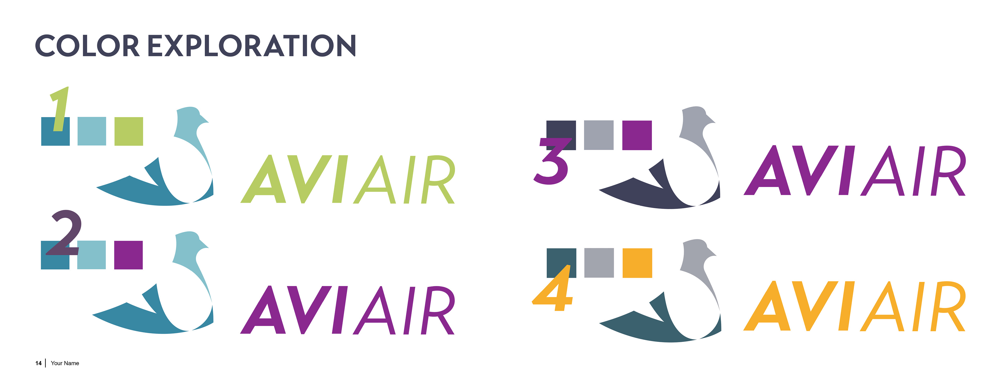
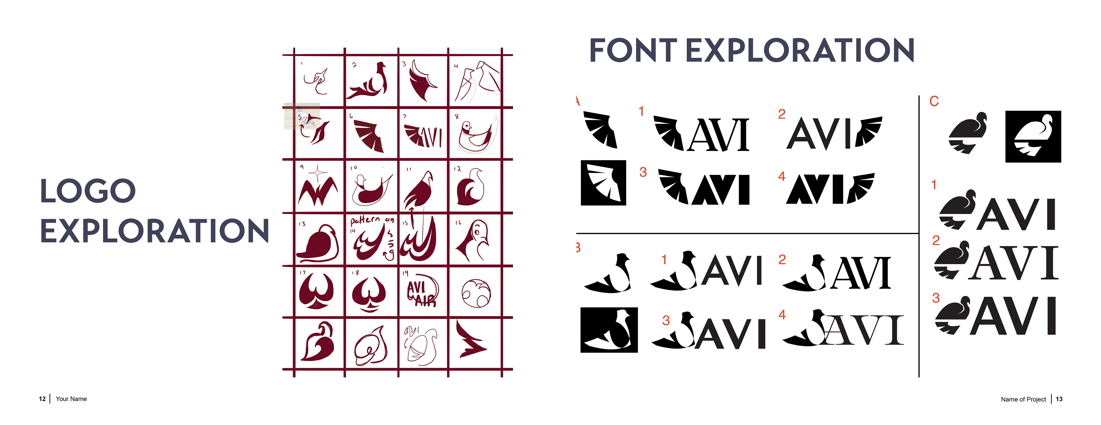
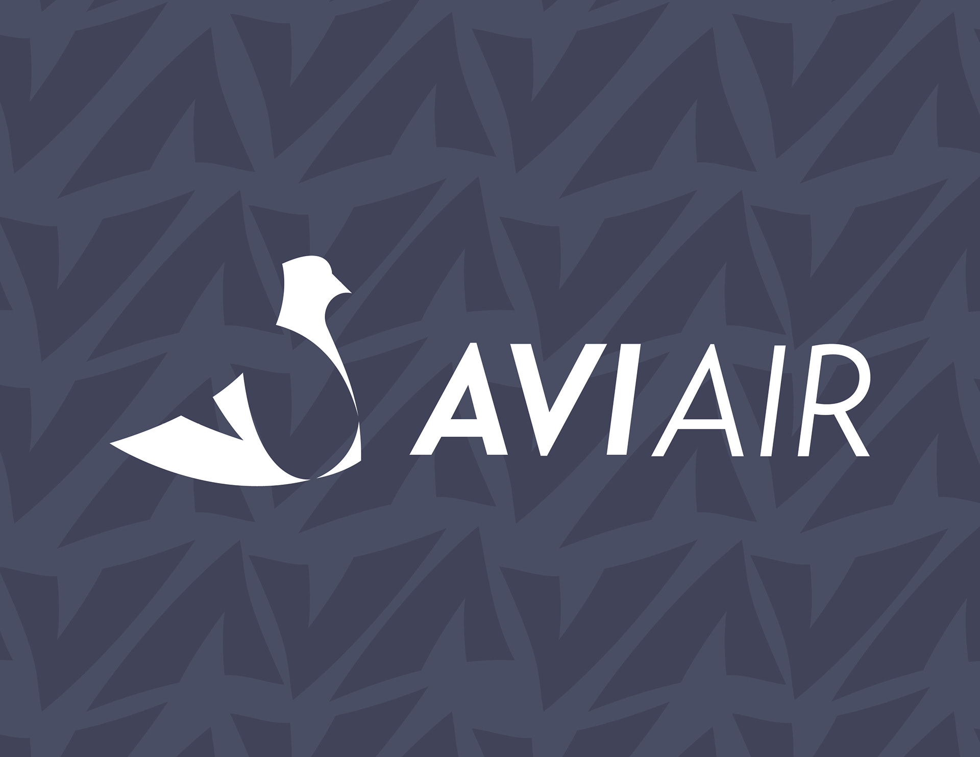
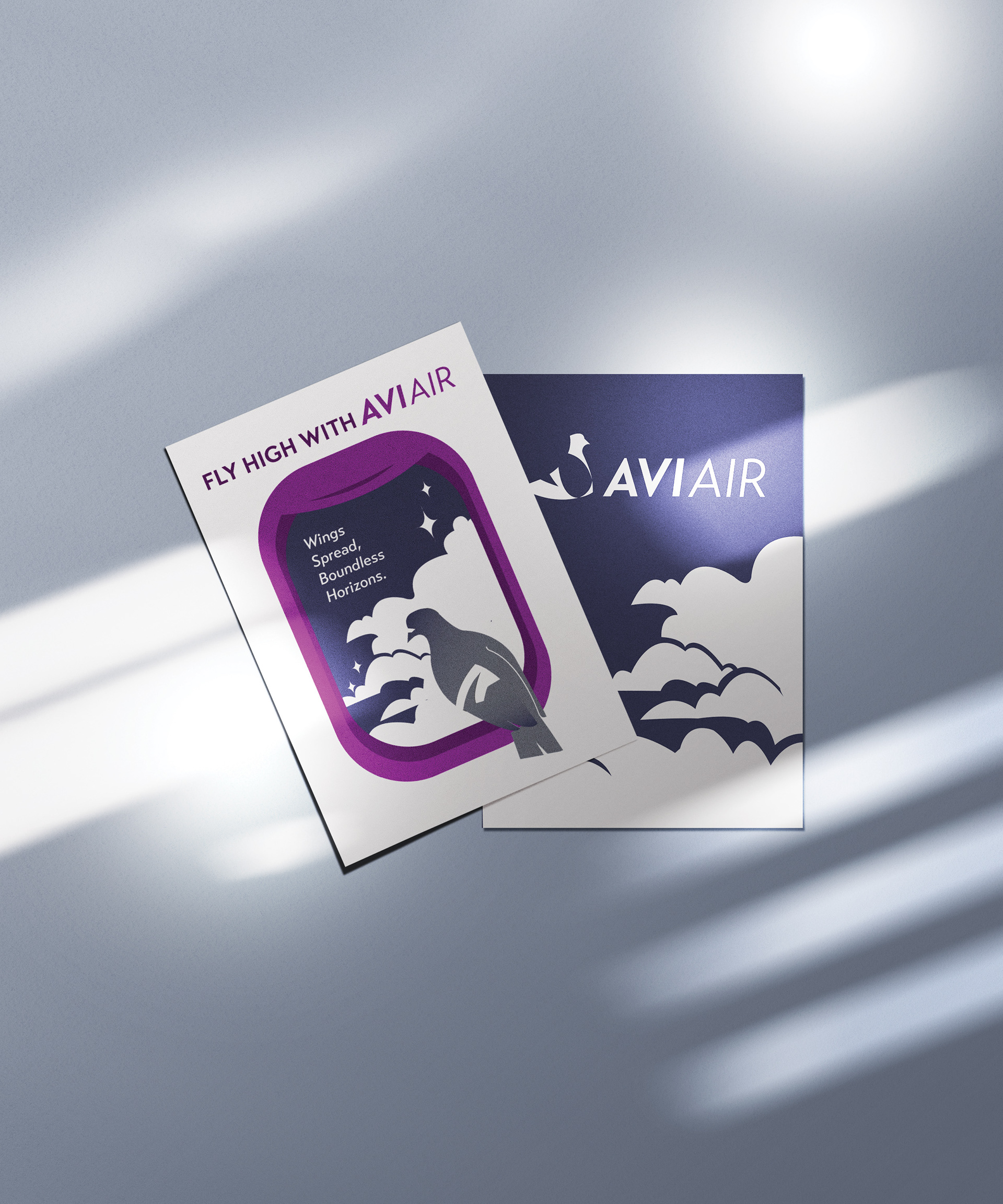
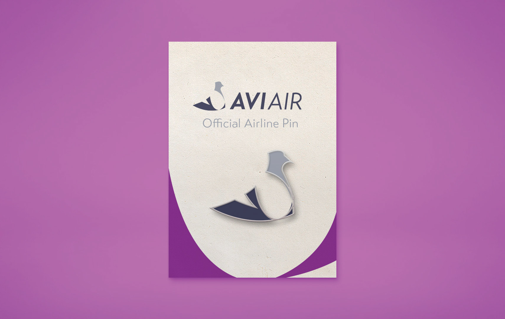
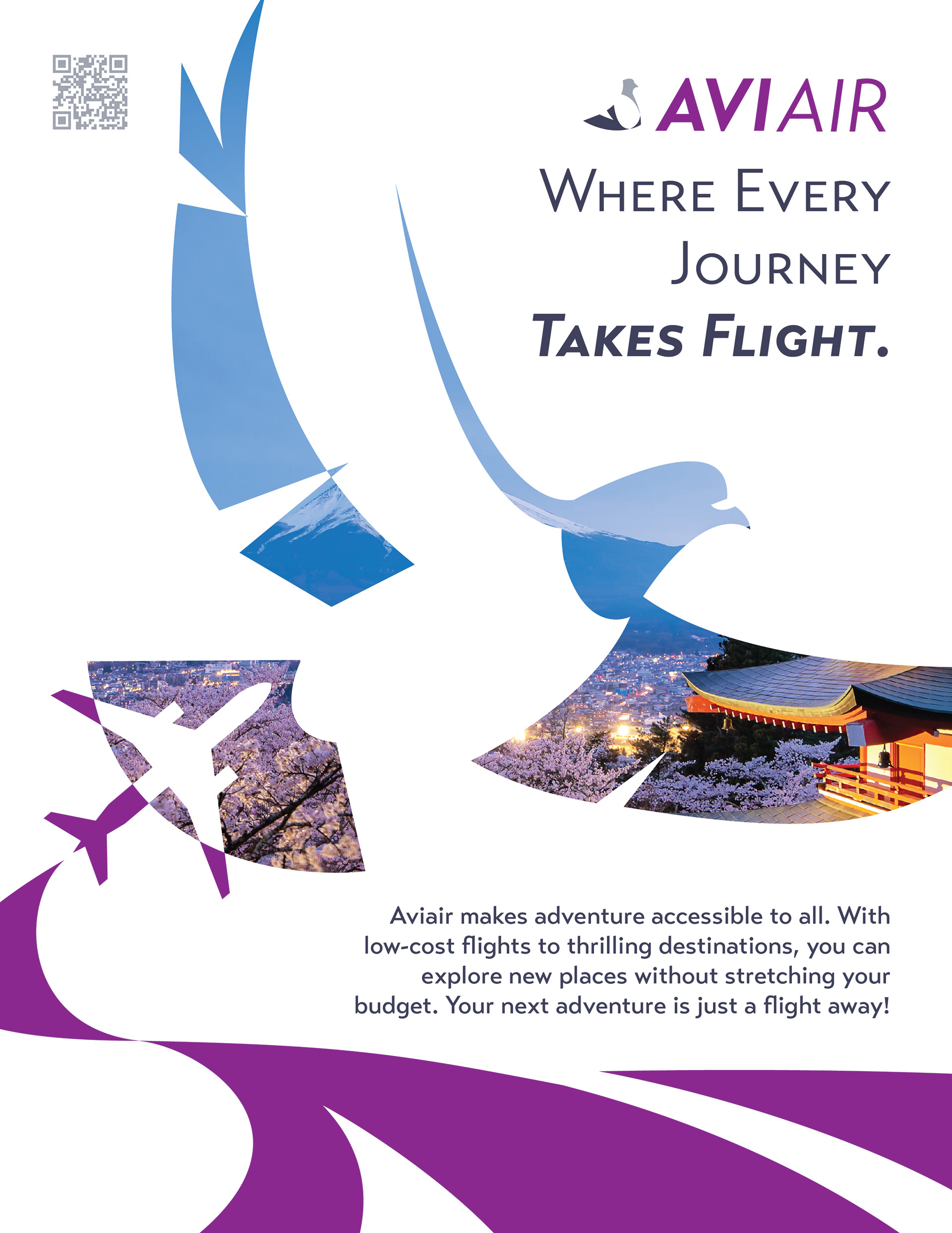
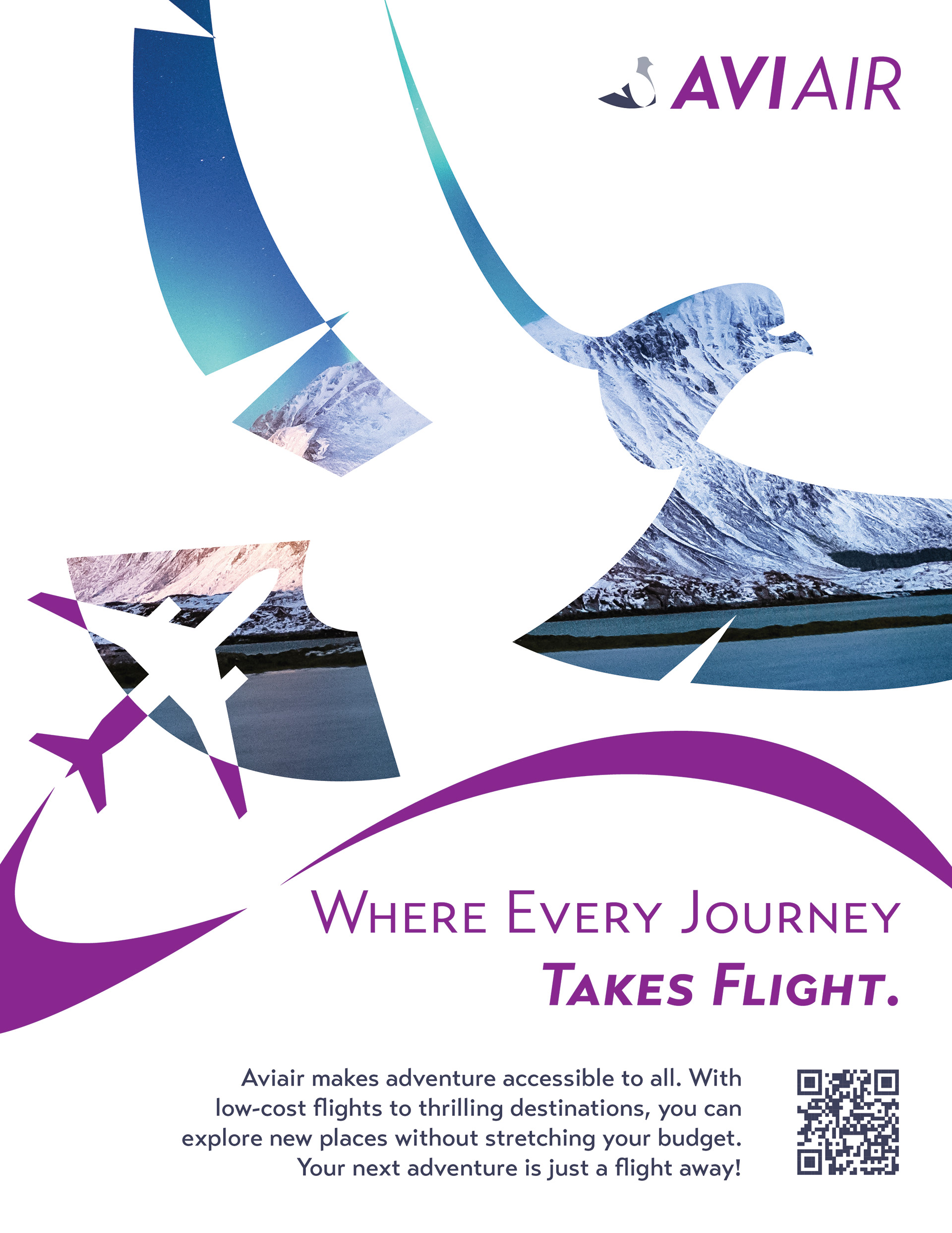
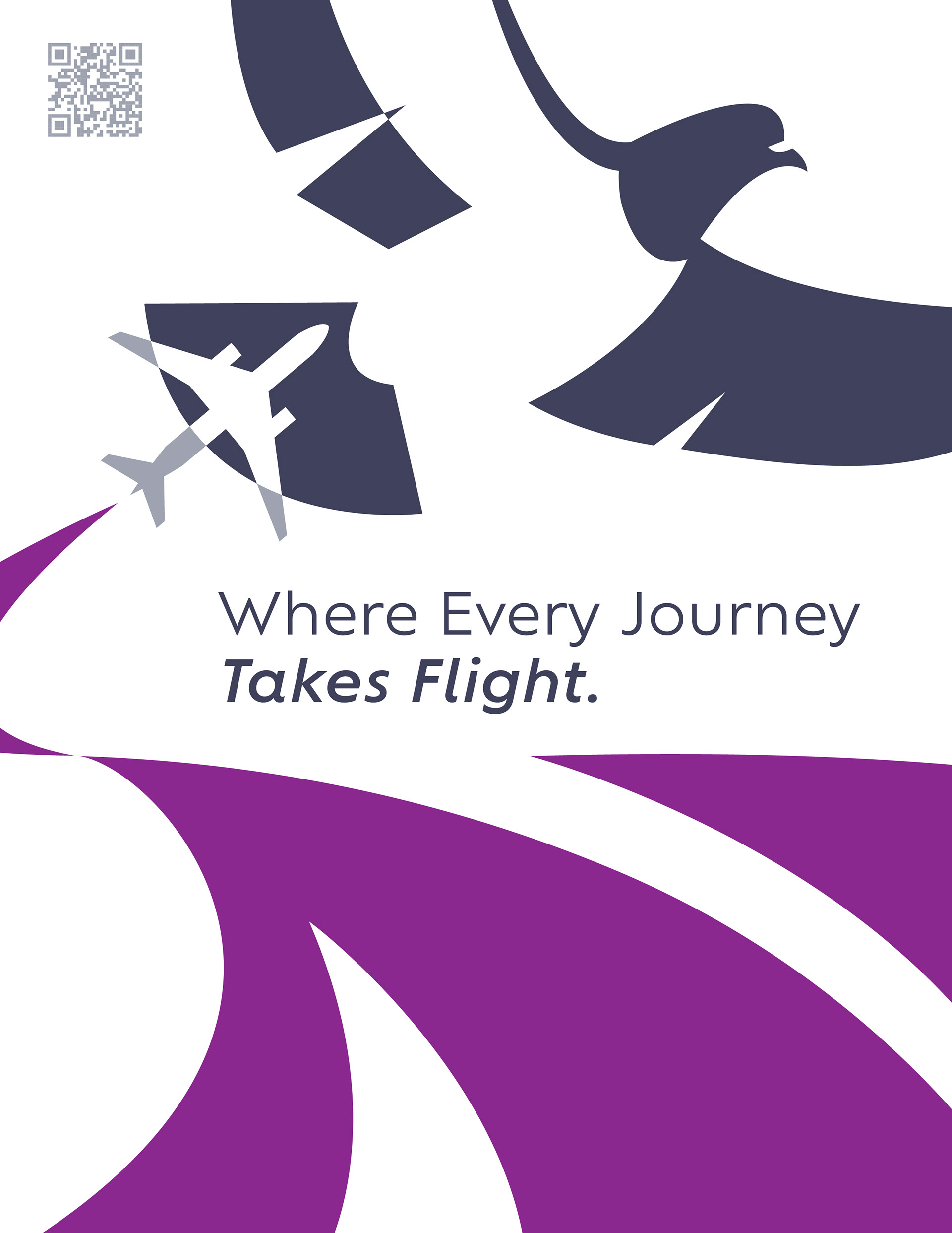
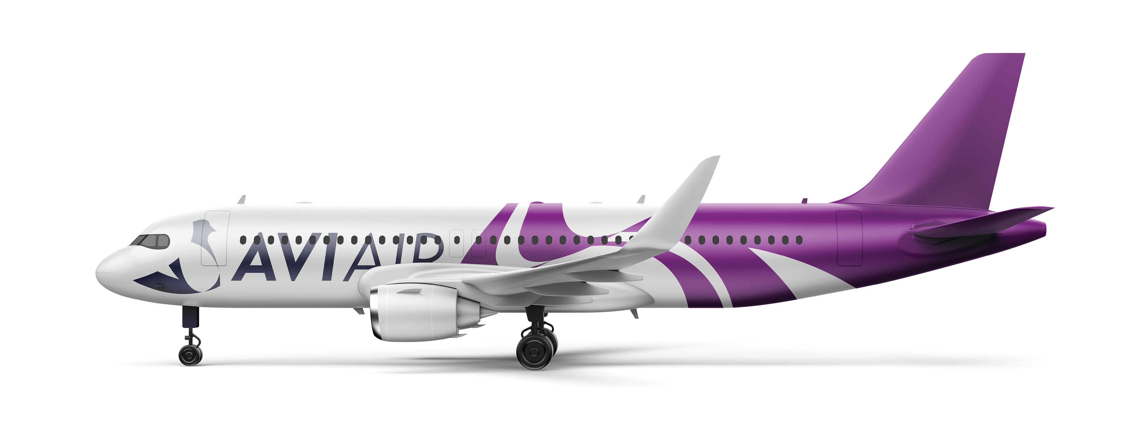
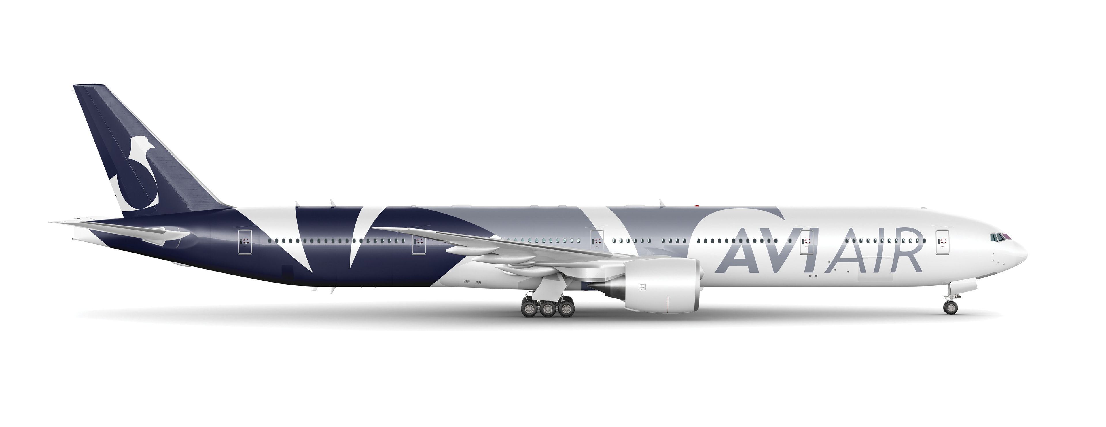
I began by researching the symbolism and history behind aviation, birds, and aviaries to explore different directions for the brand identity. The final concept was inspired by the shape and familiarity of the pigeon, a bird that felt fitting for an airline focused on accessibility and the everyday traveler. I explored a modern, simple color palette inspired by the natural tones and symbolism associated with pigeons, creating an identity that feels contemporary while staying down to earth and not scaring off a casual customer.